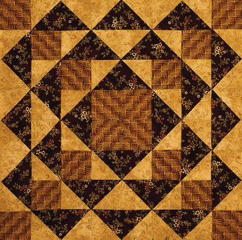
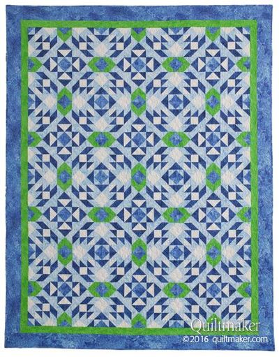
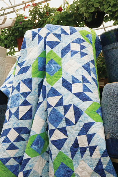
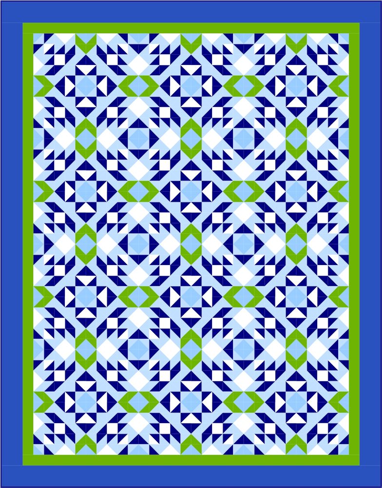
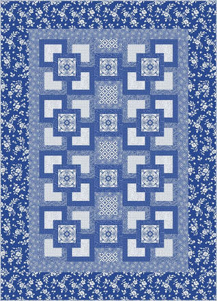
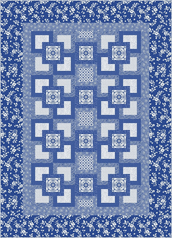
N.Q.M. B.O.M. ROUND 3 - BLOCK 4
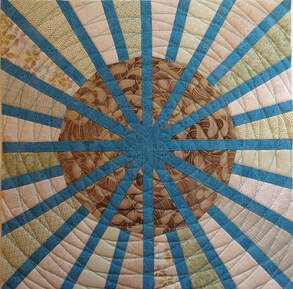
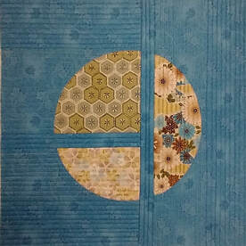
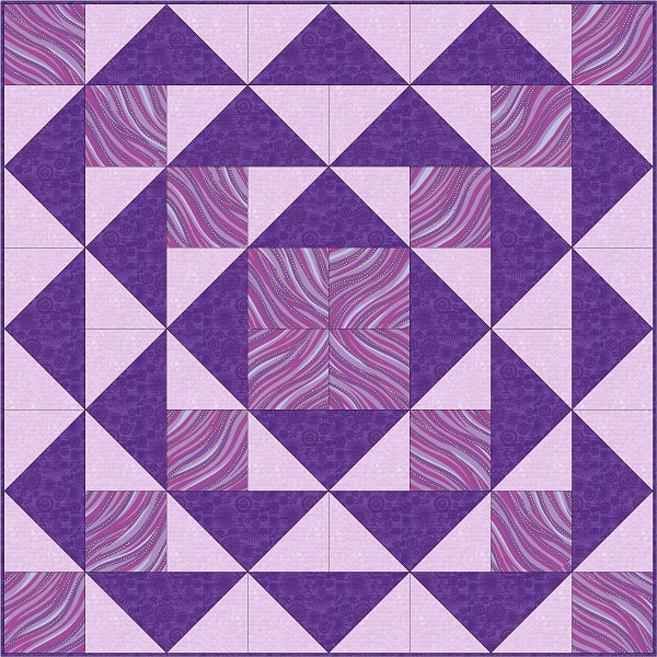
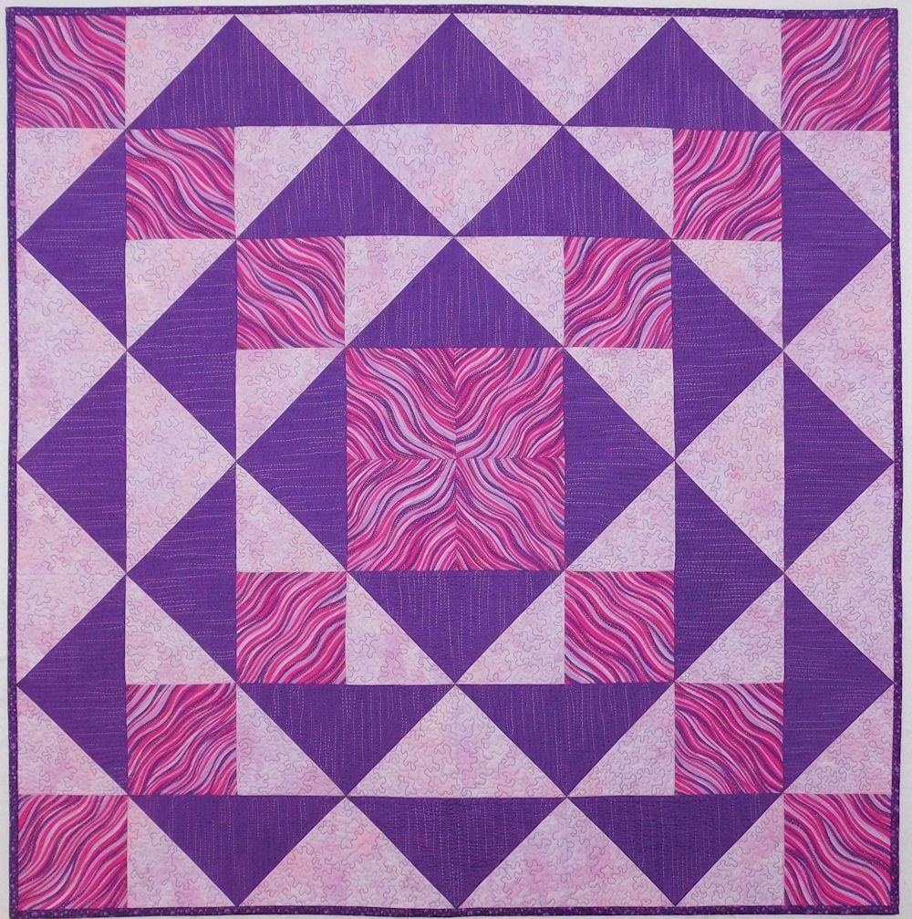
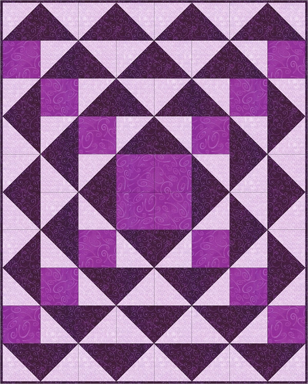
Happy Spring everyone! I finally finished the National Quilt Museum block of the month for April! It took a longer time than other months to finish this block and create a blog than previous months. The garden was calling me and it hasn’t stopped. Also this wasn’t any easy design to piece or pick fabrics for. I had so many ideas in my head but I finally settled on one. Voila!
As a quilter and a gardener I have many projects that I’m juggling. Although I’m not going to go into a great deal of detail discussing how I constructed this block, I do have a few tips that I would like to share with you. First I really want to recommend that you explore different ways of foundation piecing until you find what works for you. It's a very useful technique. If you are not already familiar with foundation piecing or are discouraged by foundation piecing I recommend that you check out the books below. Especially the Experts guide as you get multiple ideas about how to complete the same task. You can mix and match techniques until you find what works for you.
Experts' Guide to Foundation Piecing by Jane Hall (Editor)
Flying Colors: Design Quilts with Freeform Shapes & Flying Geese by Gail Garber
Experts' Guide to Foundation Piecing by Jane Hall (Editor)
Flying Colors: Design Quilts with Freeform Shapes & Flying Geese by Gail Garber
 |  |
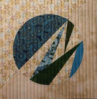
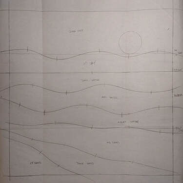
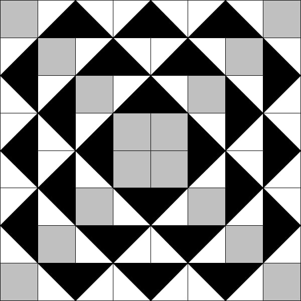
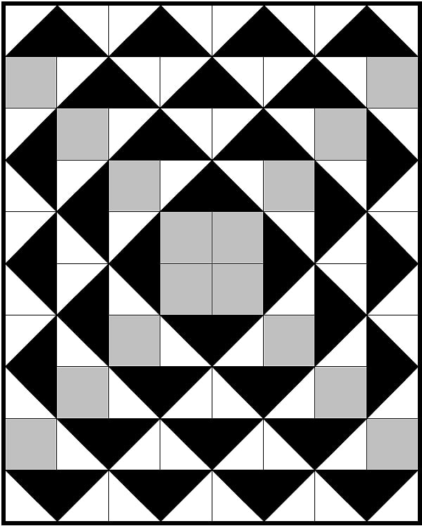
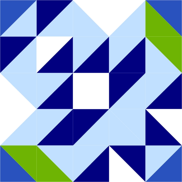
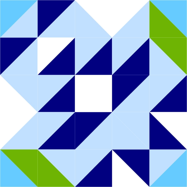
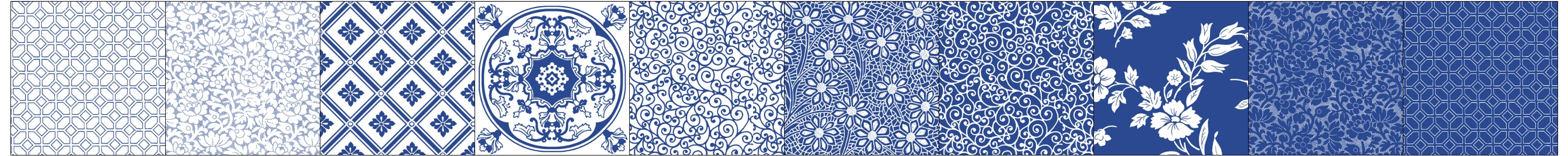
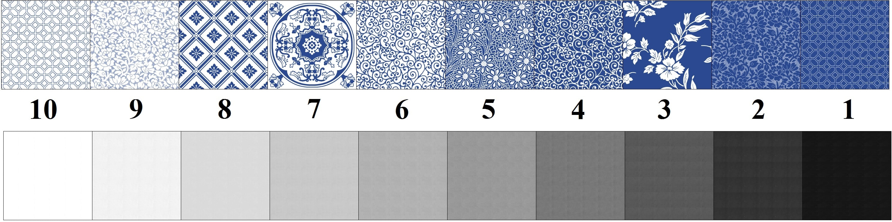
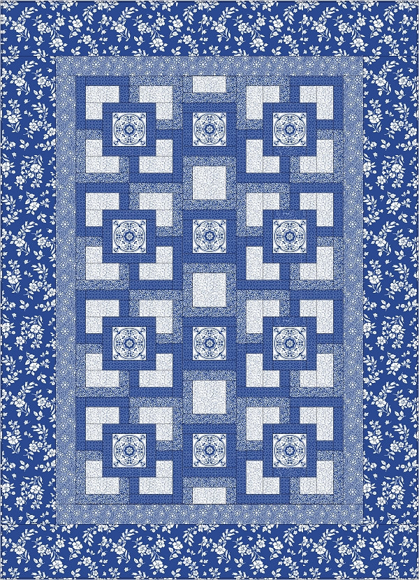
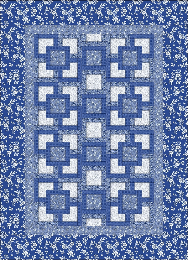
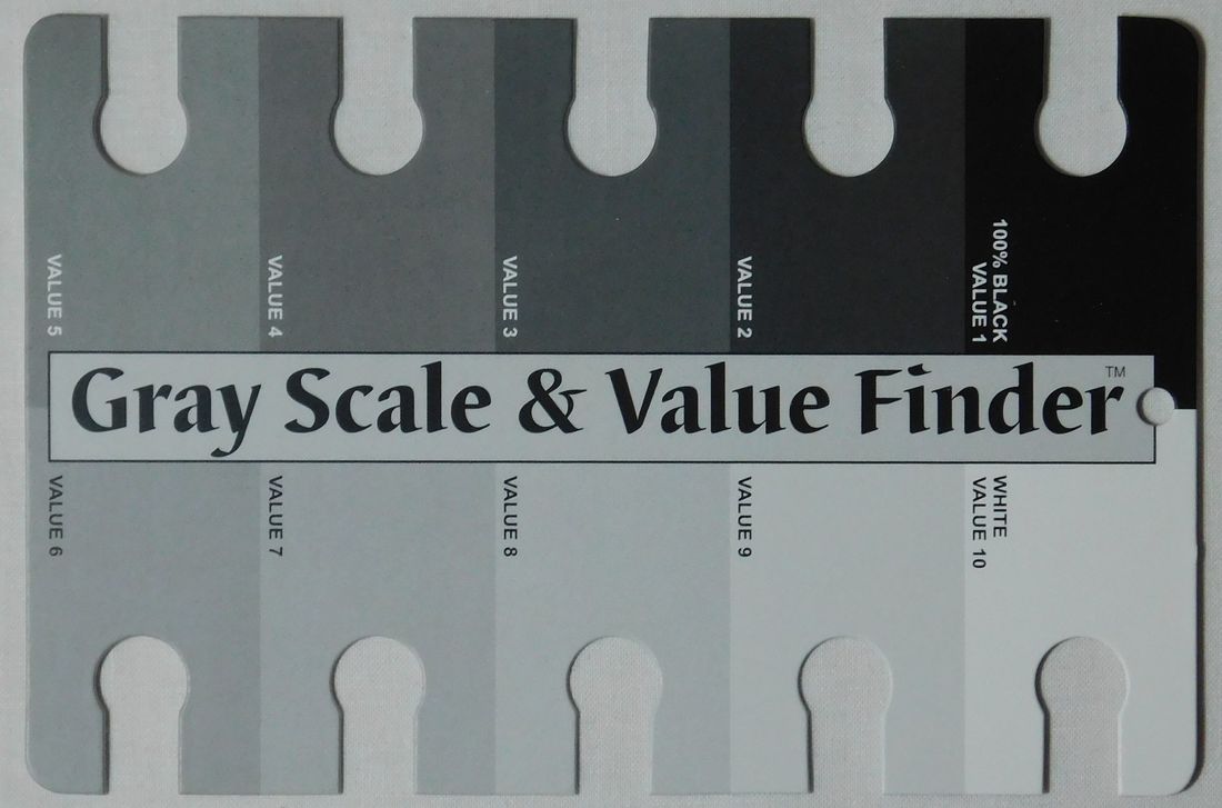
The first thing I had to do was decide on was how I wanted to map the values in this block design. In other words I had to decide where the dark, medium and light values should be placed in the design to give it the most visual movement. I opened up the PDF to the coloring page and I copy and saved it as an image file. I opened this file up in my Microsoft paint program and then I created a pallet of grays from light to dark including white and black that I used to create different ideas.
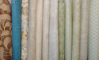
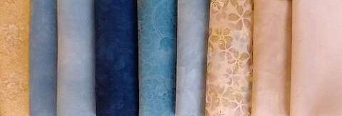
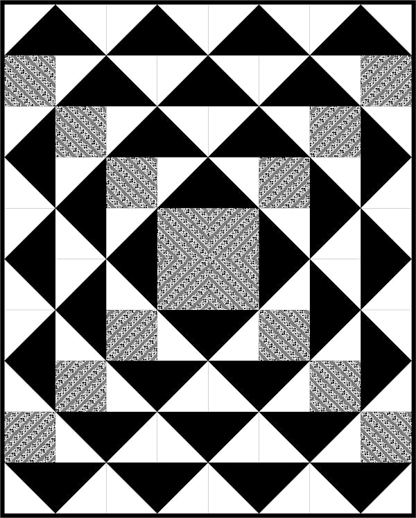
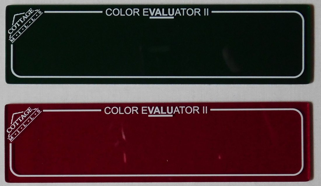
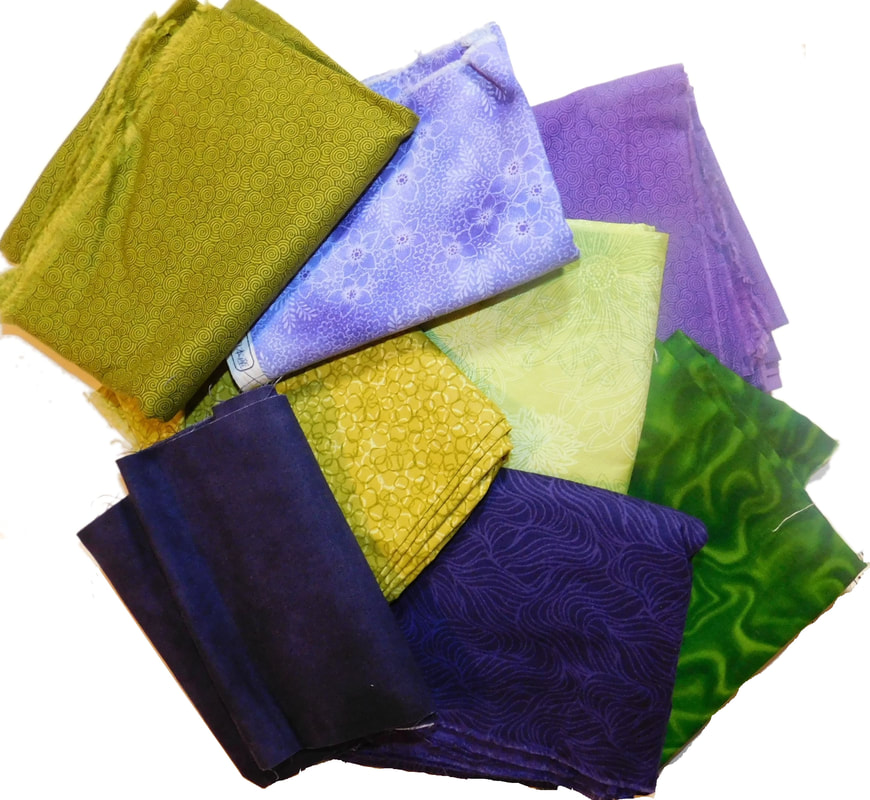
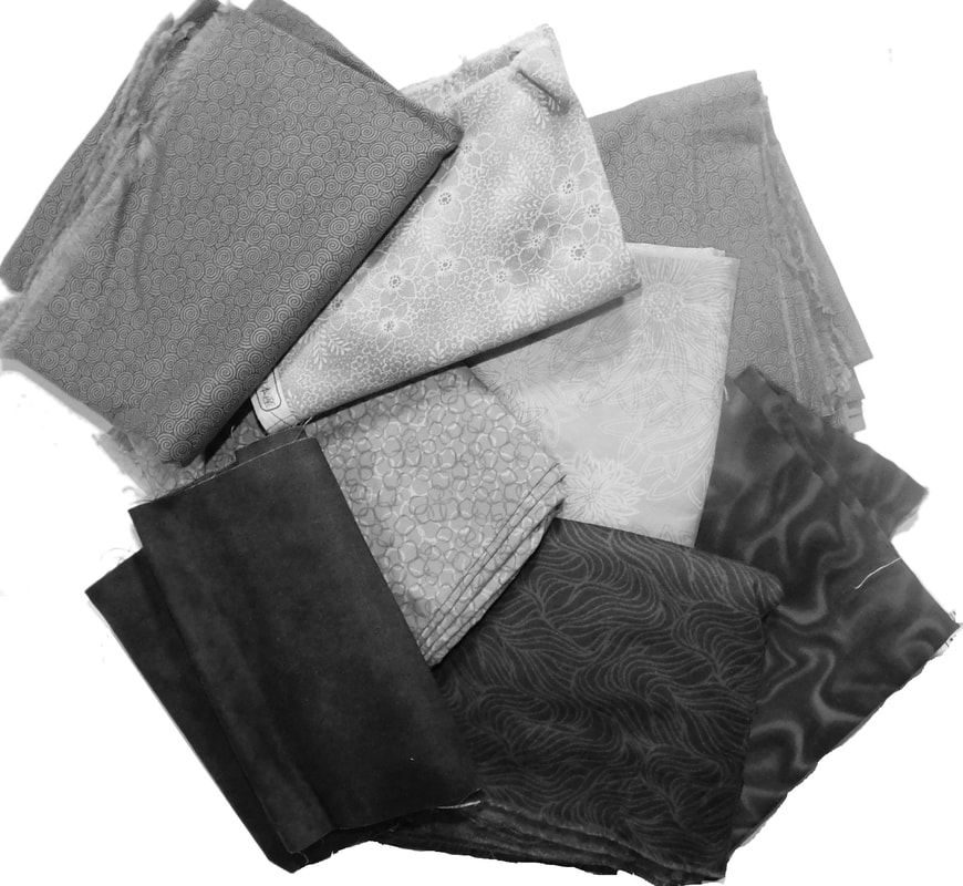
In the end, I decided not to veer too far away from what the designer offered. I just changed the values a little bit to give the design more bit more interest. Once I decided on the values that I would use in the design, I used a grayscale value finder to designate the value of each gray. I then used this information to go through my stash and find fabrics in similar values to use in my design.
In the end, I decided not to veer too far away from what the designer offered. I just changed the values a little bit to give the design more bit more interest. Once I decided on the values that I would use in the design, I used a grayscale value finder to designate the value of each gray. I then used this information to go through my stash and find fabrics in similar values to use in my design.
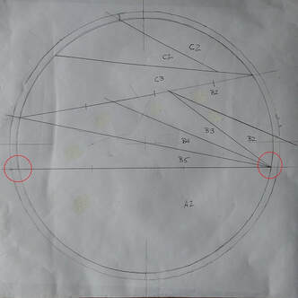
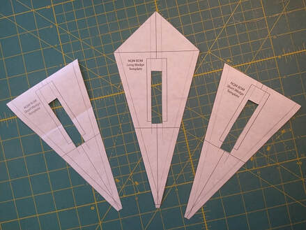
To cut down on confusion regarding which rectangle was which in the foundation piecing of this block, I decided to assign each template piece an identity to help me keep track of what went where. I started with template piece A1 and named it the letter J. Then I named template piece B1 as the letter K and so on. I also created a copy of the block from the coloring page with all of this information written on it. This way I had a visual representation in front of me for quick reference.
The instructions for the pattern told us to tape together the six template sheets. I recommend that you do not cut this up for your foundation piecing but instead consider it your master draft for this work. You might need it to trace out additional units if you run into trouble constructing this block.
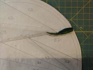
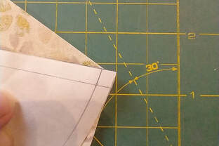
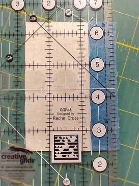
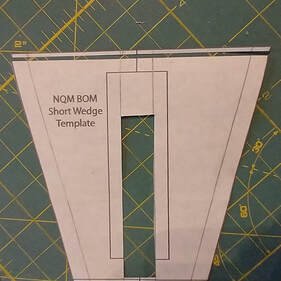
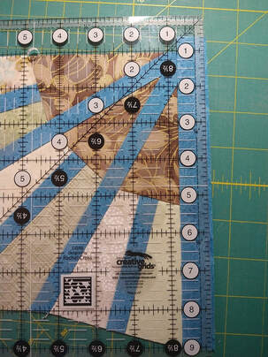
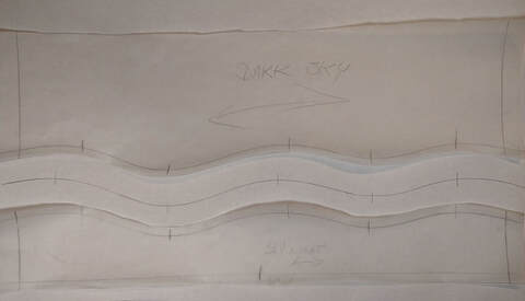
I then made a draft of the complete circle with all the units connected. The reason I did this was so that I could measure each unit and double check it against the suggested measurements given in the color placement key. I took a class with Gail Garber and She recommended that you measure the longest side of a triangle for the length of your rectangle and then the height using that side as your base. To this dimension she added one inch on all sides. This gave you plenty of room for foundation piecing so that you would not end up with a gap. She makes a point of saying that if you feel that this is a waste of fabric think about how you'll feel if you have to cut a second piece because you messed up the first one. The second image shows the dimension I used.
I then made a draft of the complete circle with all the units connected. The reason I did this was so that I could measure each unit and double check it against the suggested measurements given in the color placement key. I took a class with Gail Garber and She recommended that you measure the longest side of a triangle for the length of your rectangle and then the height using that side as your base. To this dimension she added one inch on all sides. This gave you plenty of room for foundation piecing so that you would not end up with a gap. She makes a point of saying that if you feel that this is a waste of fabric think about how you'll feel if you have to cut a second piece because you messed up the first one. The second image shows the dimension I used.
I traced my foundation pattern pieces from my draft of the circle onto freezer paper. I did this with the shiny side facing down or away from the surface closest to me. You can use a light box for this or tracing wheel. I highly recommend that you use freezer paper because this design has large pieces and they can flop around which can affect the amount of control you have on accuracy while you are foundation piecing. When I sewed unit C to unit B, I pressed the seam towards unit C as recommended in the directions but I noticed there was a large amount of bulk near the B1 unit. Therefore I decided to press the seam partially open to reduce the bolt.
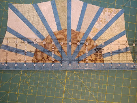
I decided to use two fabrics in the background of my circle design even though I knew it would add to the challenge. sewing a one piece background to a circle is far easier than working with two partial circles. When you sew the background piece to the partial circle you want the background piece on top. You also want to make sure you offset slightly at the beginning and end to account for the quarter inch seam allowance.
Never clip the fabric unless you're working with a very tightly woven and dyed. Most fabric does not need to be snipped to stretch for a quarter inch seam. That's only something that is done and dressmaking when working with curve seams. To make it easier you can draw the quarter inch seam line on the wrong side of the background piece and only pin through that seam line when you pin the two pieces together. I left the freezer paper on the back of both partial circle pieces as I sewed the background pieces onto them. This helped with accuracy kept the circle fabric stationary as I manipulated the fabric on top.
Once you have sewn the background pieces to the partial circles you might notice some distortion along the diagonal. My solution to situations like this is to draw on my ironing board cover. I have a plain canvas or any word cover and the first thing I do after I wash it is draw two lines 6 inches apart the length of the ironing board. I can then place the completed partial block on the ironing board along that line and see where and by how much it is distorted. With a light steam and a touch I can persuade the fabric to follow a linear path.
Once you have sewn the background pieces to the partial circles you might notice some distortion along the diagonal. My solution to situations like this is to draw on my ironing board cover. I have a plain canvas or any word cover and the first thing I do after I wash it is draw two lines 6 inches apart the length of the ironing board. I can then place the completed partial block on the ironing board along that line and see where and by how much it is distorted. With a light steam and a touch I can persuade the fabric to follow a linear path.
If you are following the designer’s suggestion and using a two piece background, you might experience some difficulty making all the points match where unit E1 meets unit D1 along the perimeter of the circle. I use a technique called pinpoint precision to match those points. Here is a video link demonstrating how to do that. Pin Point Precision piecing https://www.youtube.com/watch?v=lLYoQoiwFlU&t=39s
After I sewed those together I go back to my ironing board and make sure that that seam is straight once again before I press it to one side.
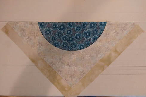
I wasn't sure if I was going to use two colors in the background or not when I started this block. Once I had the inner circle completed I placed it on top of the two color choices that I had and then I made my decision to go with a two color background
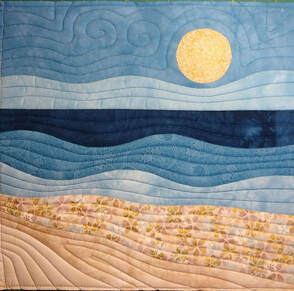
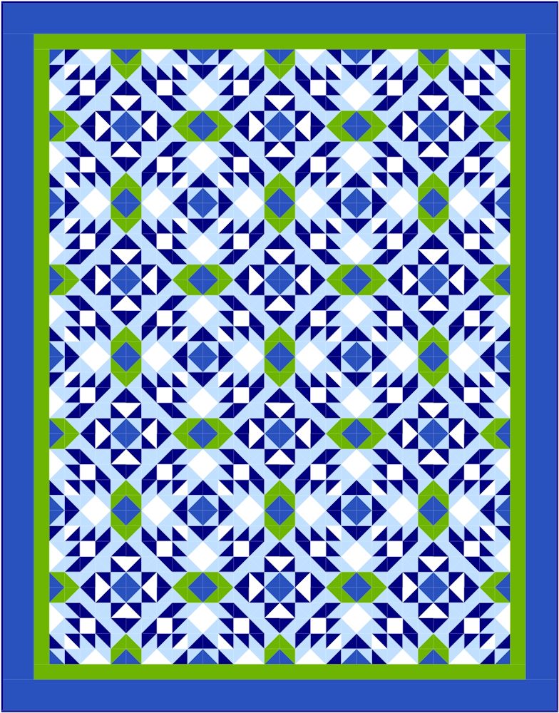
Now it was time to quilt it. I had Grand ideas about echo quilting the triangles but then I saw that the May block is a whole cloth quilted piece I decided to just use narrow channel quilting as the designer suggested but not as narrow. I stopped at a half inch spacing. I couldn't decide whether I wanted blue or green thread so I decided to use both an alternate colors. When I pick out thread for my quilting projects I try to find a value that can contrast equally on the lightest valued fabric in the block as it does on the darkest valued fabric.
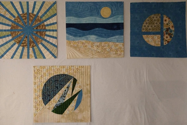
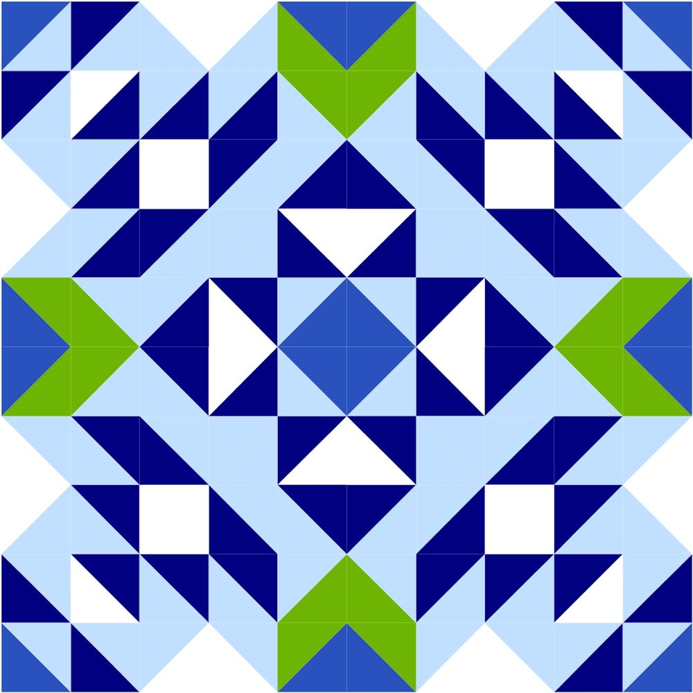
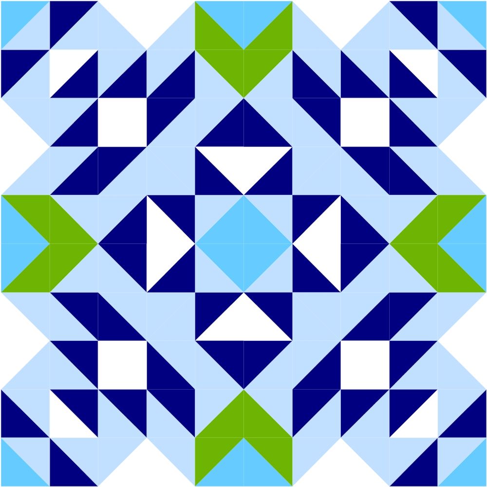
I'm really happy with how this came out. I'm very excited that I learned a new technique because I have never matched a curve seam across a straight one that I can remember. I like the way this block looks with the other three. They feel like I solid group. I look forward to the May whole cloth block.


 RSS Feed