Iris Quilts
  • Home Page
  • Galleries
  • Blog
  • Pattern & Tool Shop
  • About Janice
  • Contact Janice

QUILTMAKER'S BLOG TOUR - 100 DESIGNER BLOCKS VOL. 16

11/17/2017

130 Comments


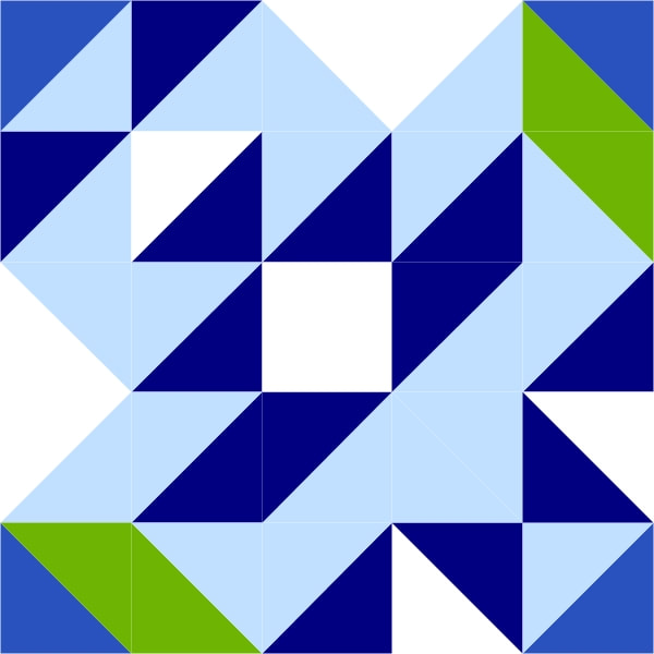
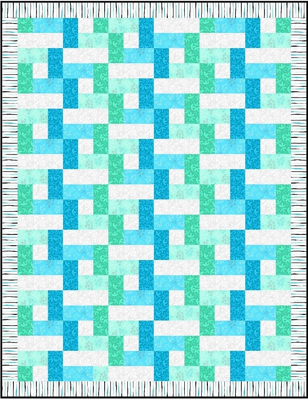
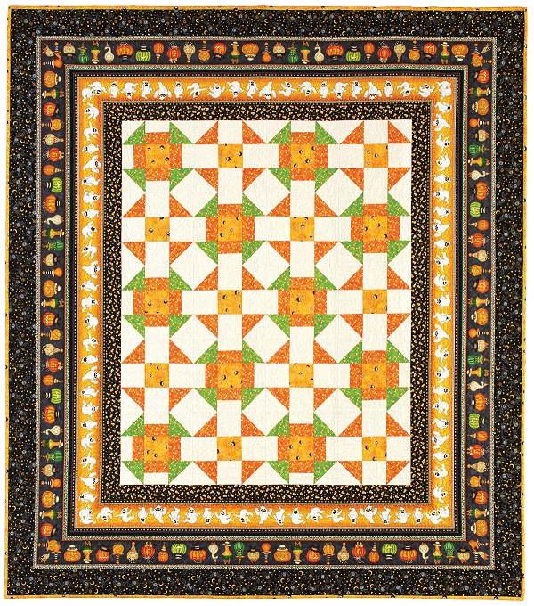
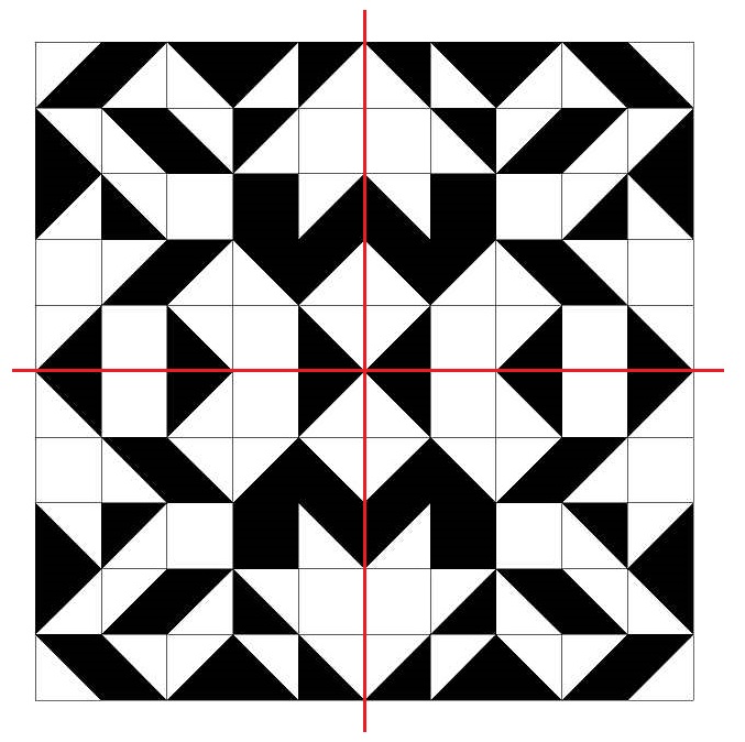
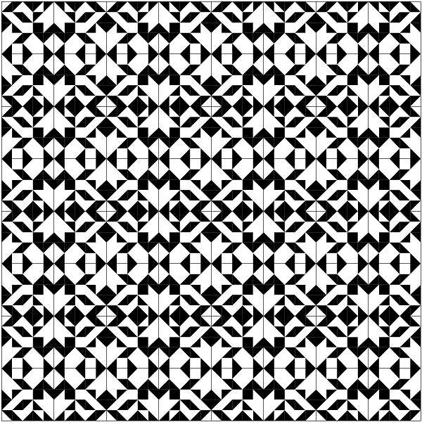
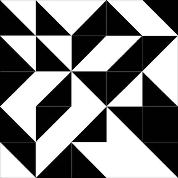
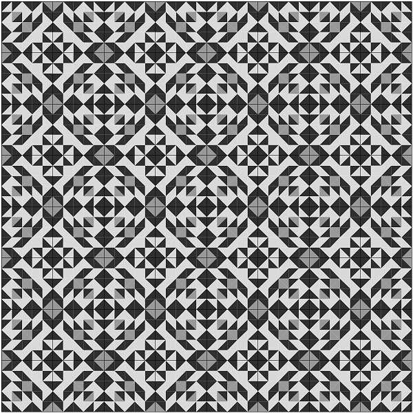
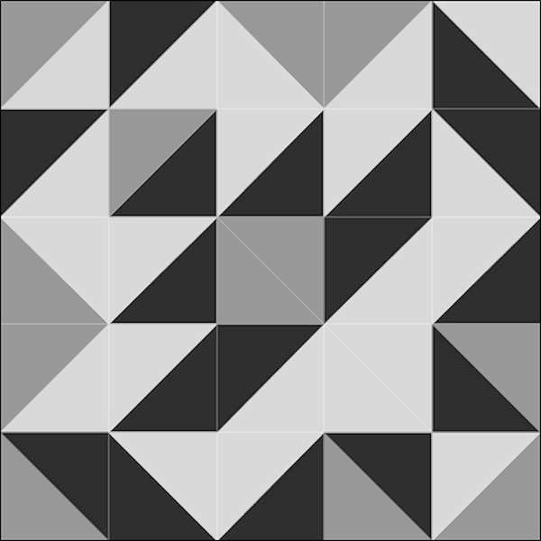
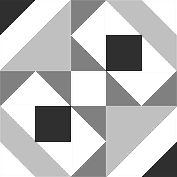
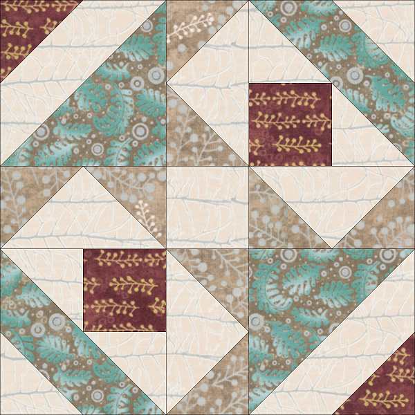
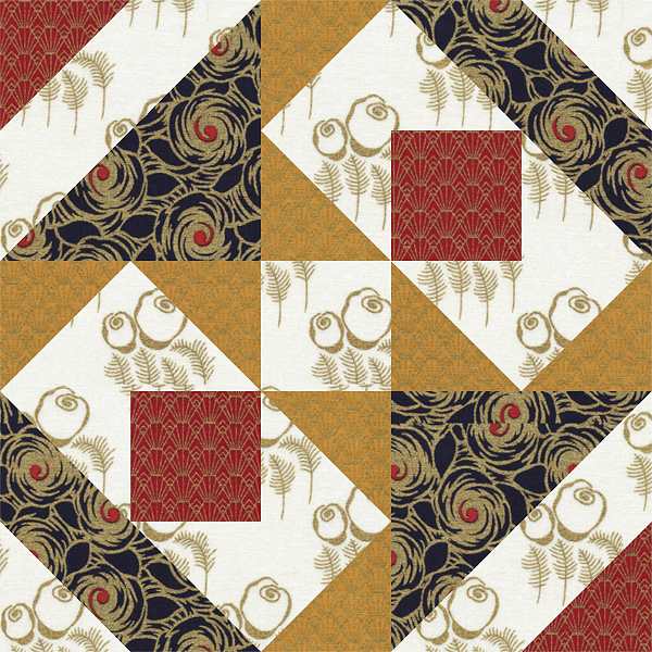
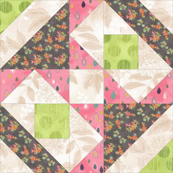
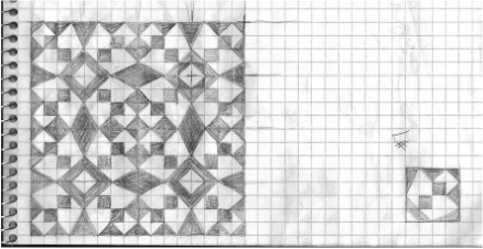
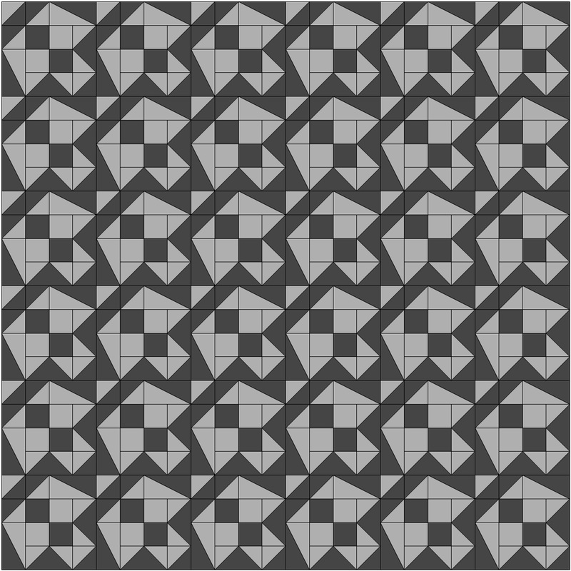
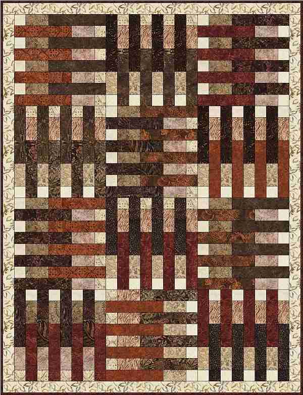
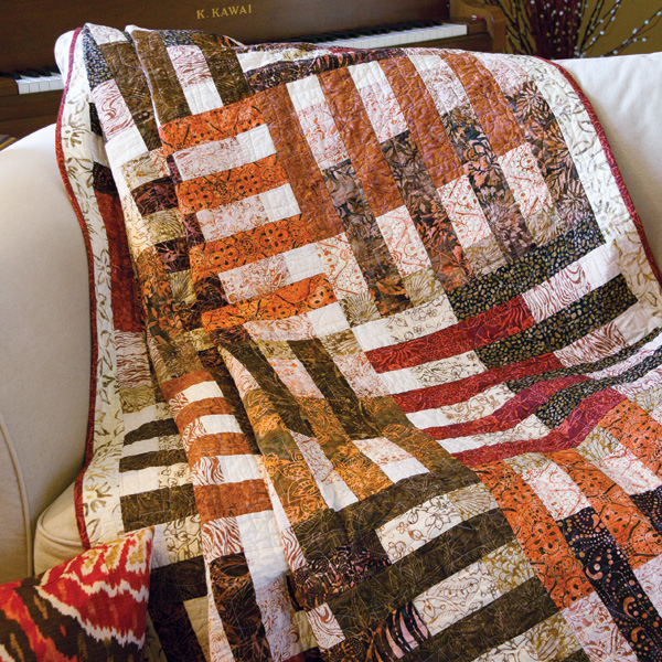
Block # 1553       Crossroad Pyramids

Picture
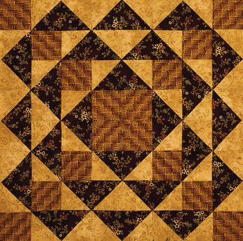
Hello my quilting friends and welcome to another stop on The Quilting Company's  Quiltmaker 100 Block Road Rally Blog Tour! I'm glad you have managed to travel this far and come visit my blog. I hope you're not too dusty from your travels. Here's my block, Crossroad Pyramids. I’m very excited to have a block featured in Volume 16 of Quiltmakers 100 Block Challenge!

I'm also excited to tell you that you can become the proud owner of your very own copy of this wonderful resource courtesy of the folks at Quiltmaker. I hope you're as excited as I am. Please read to the end to find out how you can get your copy. This offer has ended. Congratulations to Renee A.!

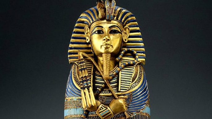
The inspiration for this block is fairly obvious, it’s the pyramids of Giza found in Egypt. I’ve always have been fascinated with Egypt ever since the King Tutankhamun exhibit came through the United states when I was a kid.

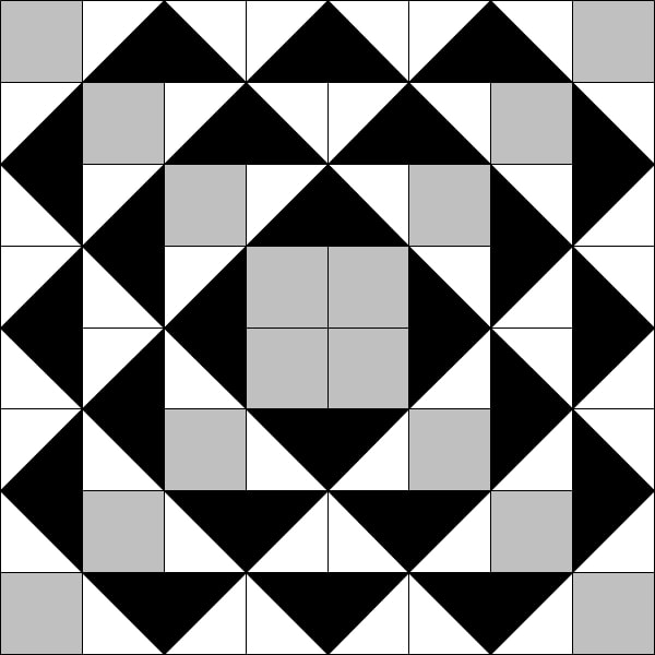
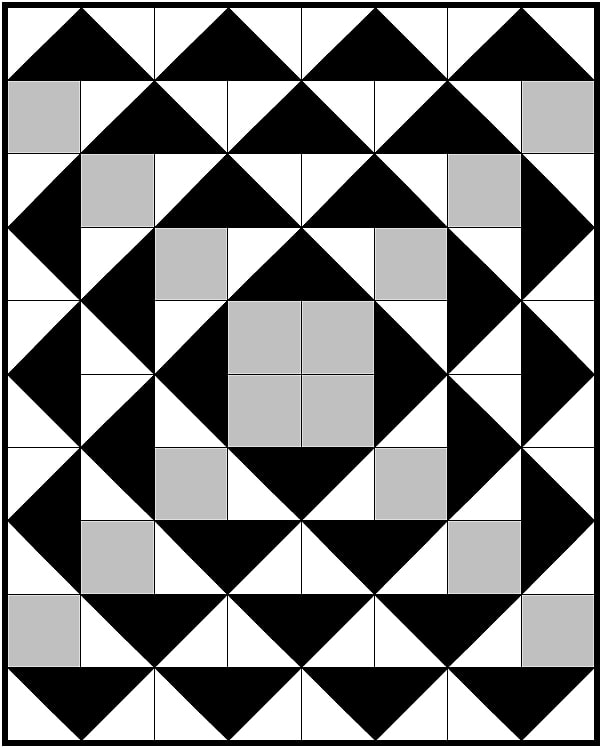
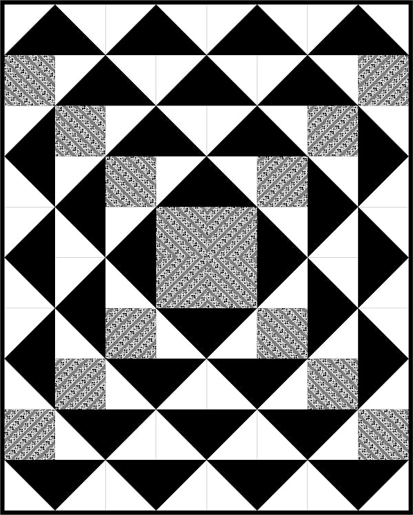
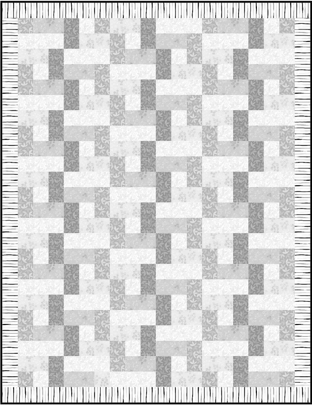
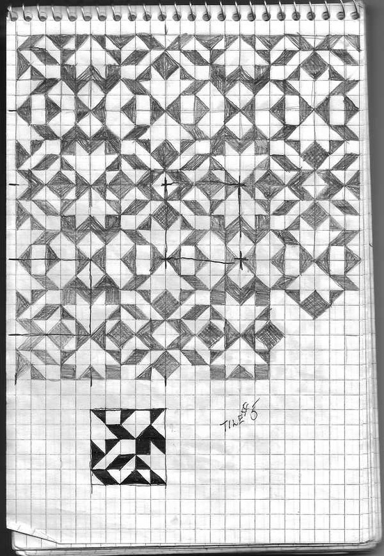
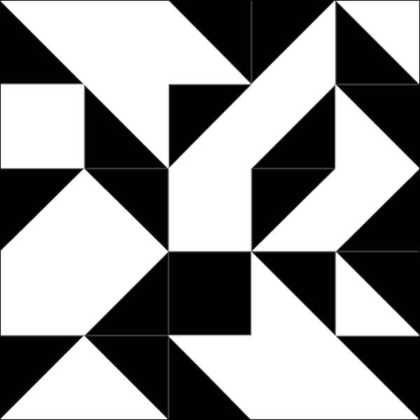
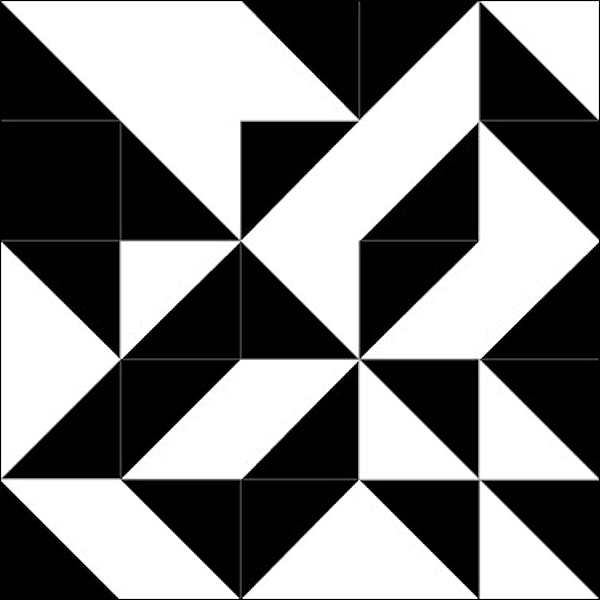
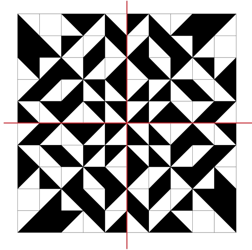
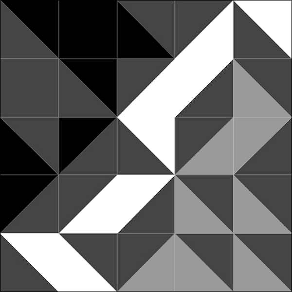
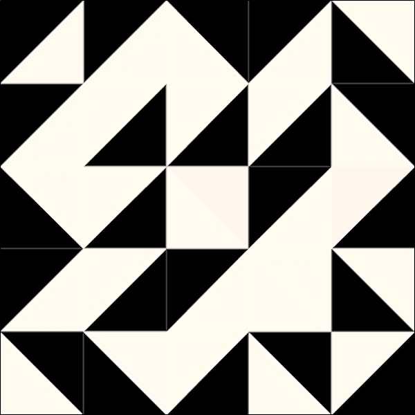
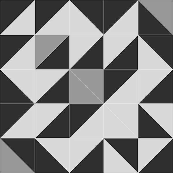
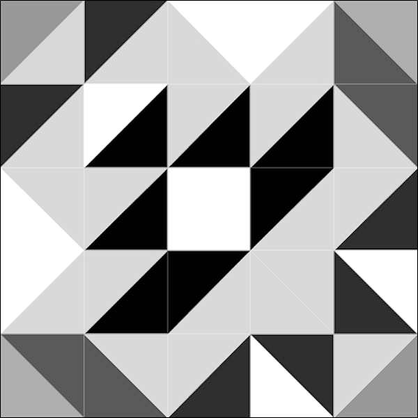
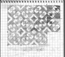
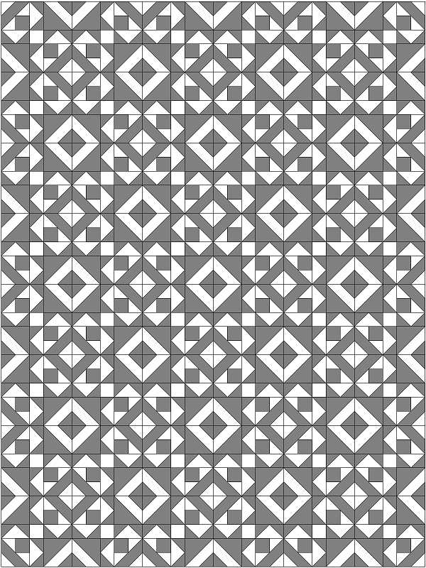
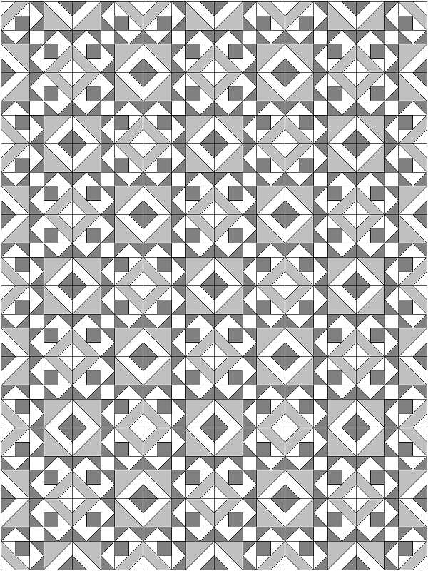
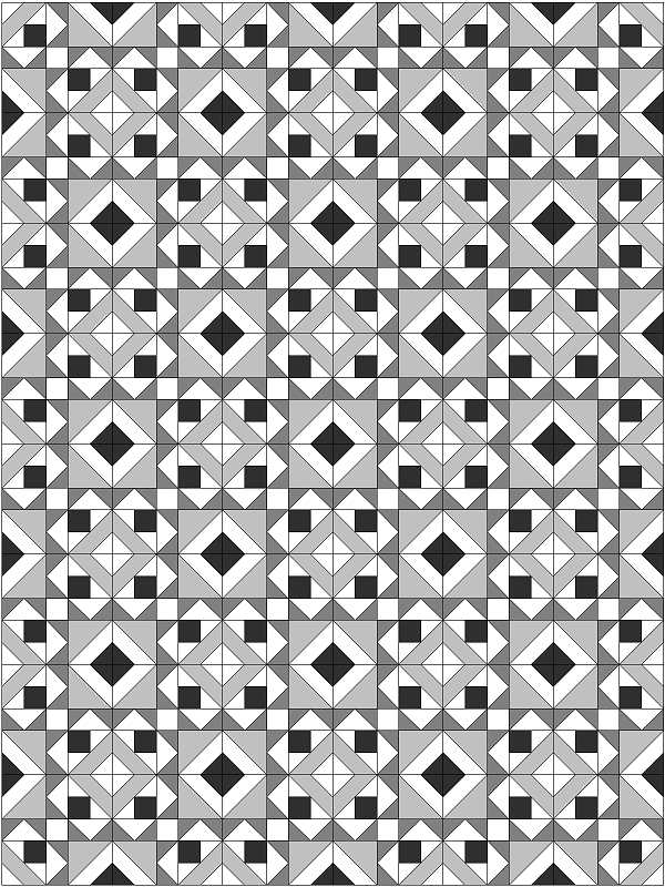
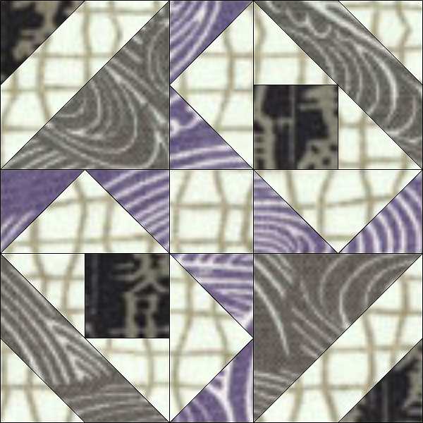
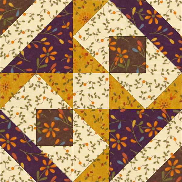
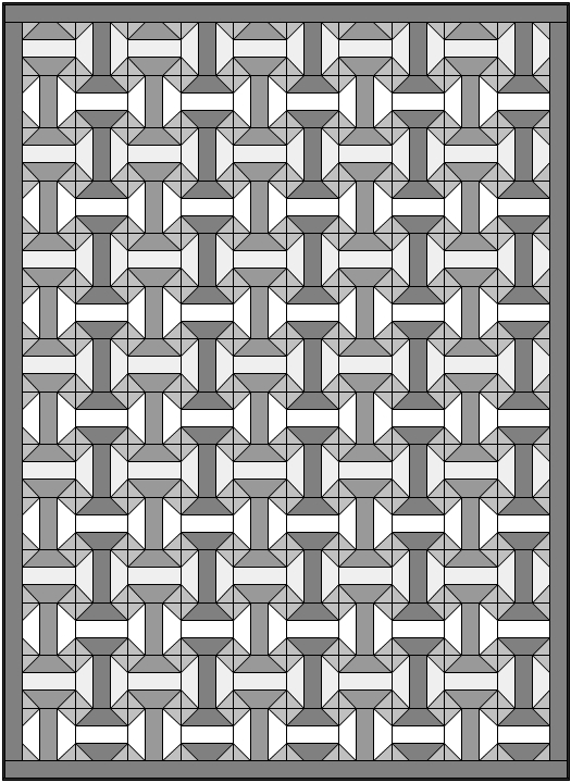
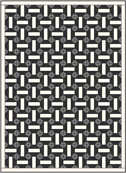
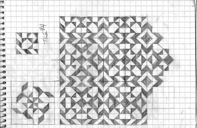
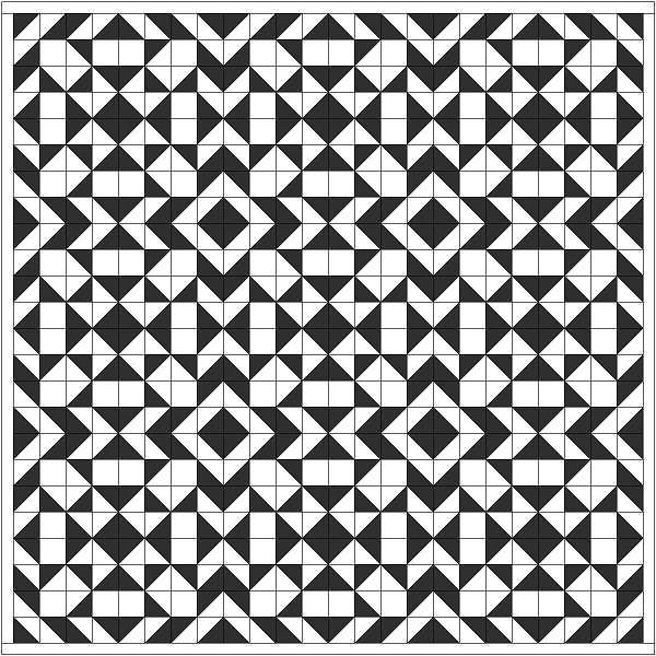
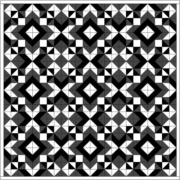
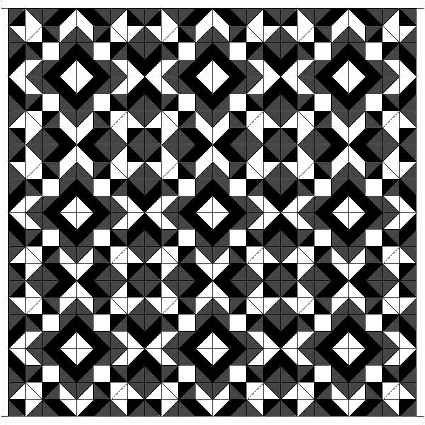
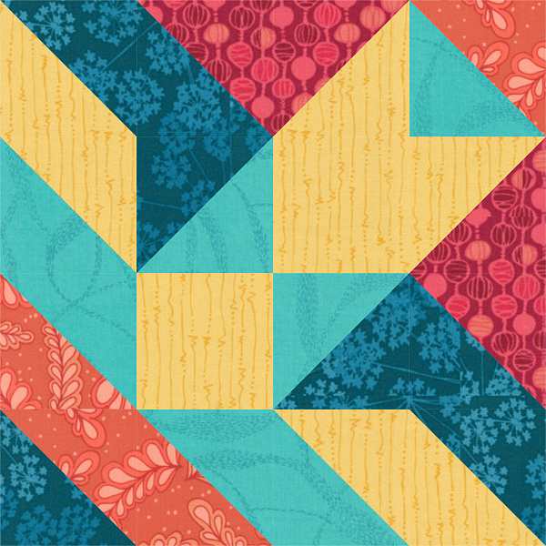
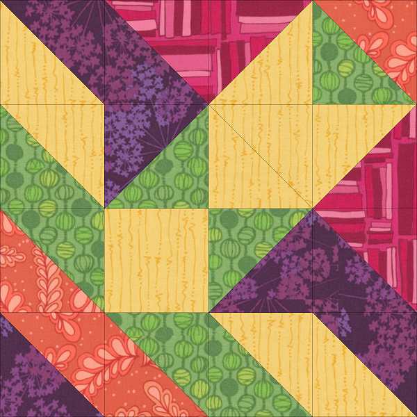
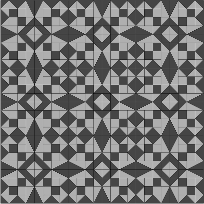
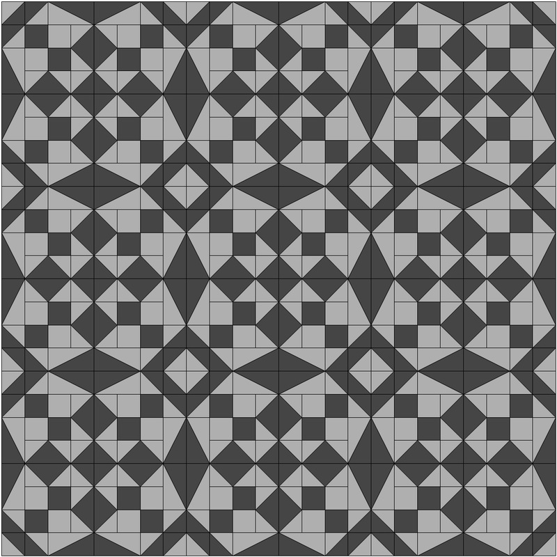
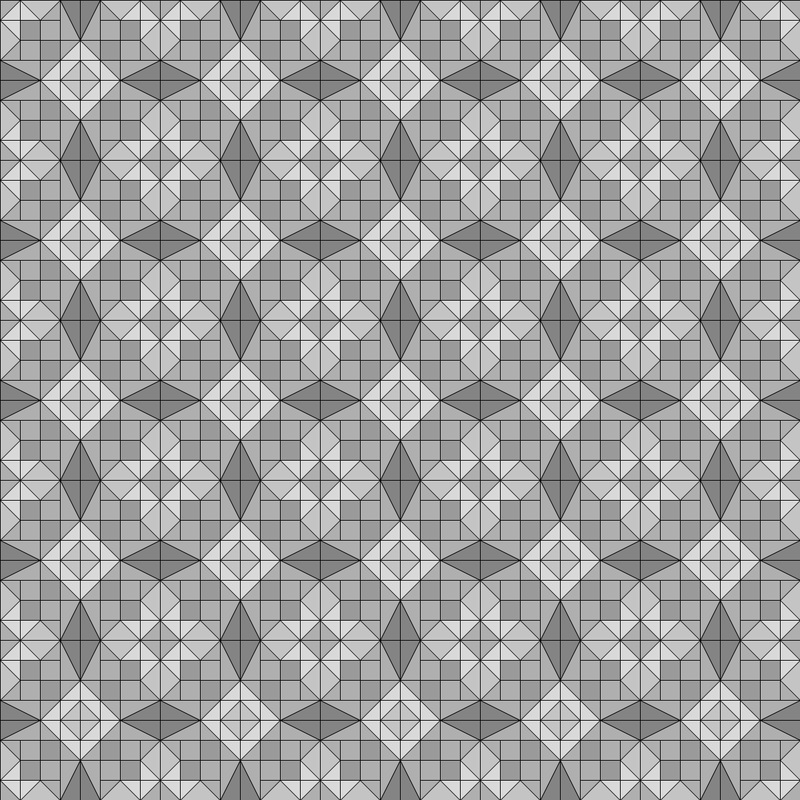
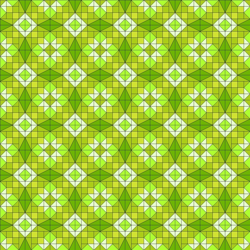
As usual I turned to my trusty EQ quilt design software to get things started and the block below on the left is what I came up with. Then I took another look at the block and I wondered what would happen if I used striped fabric in the place of the medium value. The block below on the right is the result. I rotated the stripe so that they all met in the middle. Now that things were moving along nicely it was time to pick out some fabrics to use.
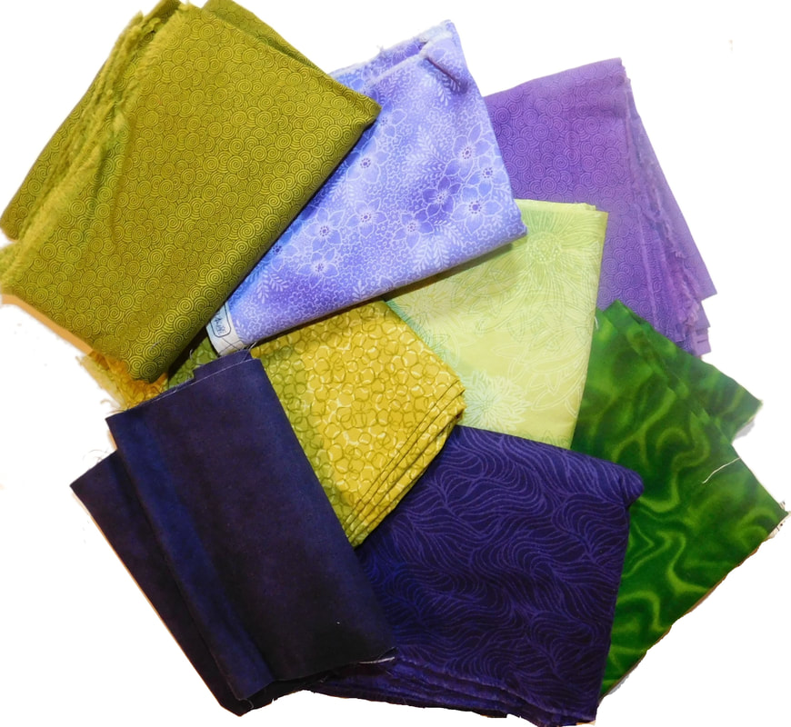
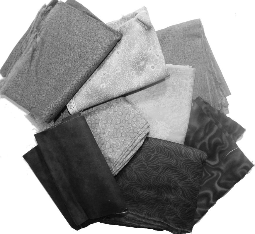
I dug out a bunch of directional and striped fabrics from my stash to audition for the block. It was important to consider the scale of the printed fabric in relation to the size of the finished unit. The block wouldn't look the way I intended if the texture of the print is too large to fit into the finished unit.

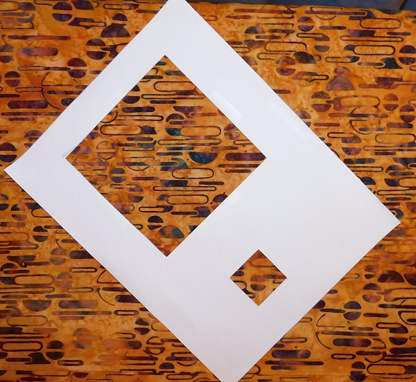
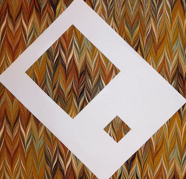
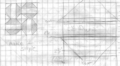
To help me make that decision I had to cut an audition window from a piece of white paper at the finished size. Since this was going to be a 12” block the unit's the finished size would be 1 ½” x 1 ½”. Here are the contestants for the block as seen through the audition window.
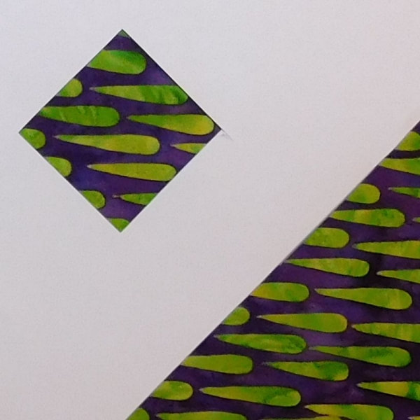
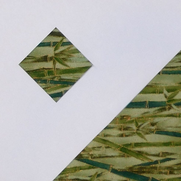
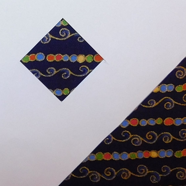
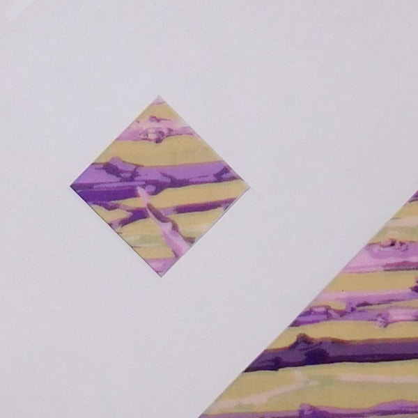
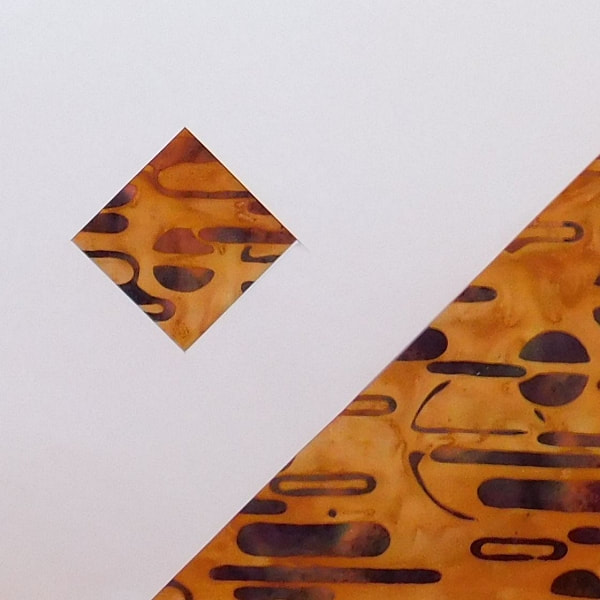
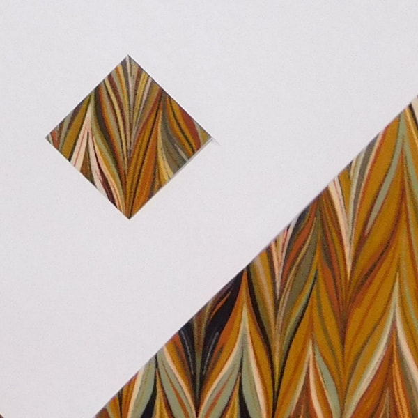
As you can see some of the other choices would have worked out well others not so well. I decided to use the brown stripe for the block. If you use a stripe it’s important to starch the heck out of the fabric before cutting into it. This will help you to control the bias. If working on the bias freaks you out then try to find a stripe that is printed on the diagonal. That way the sides of the square will be on the straight grain when you cut your units out.

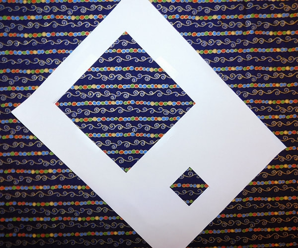
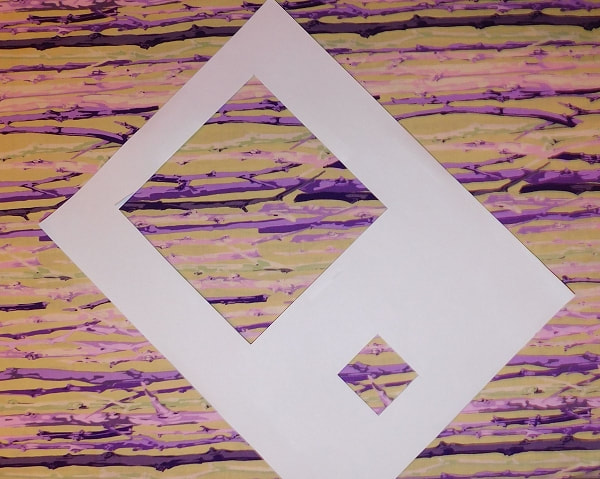
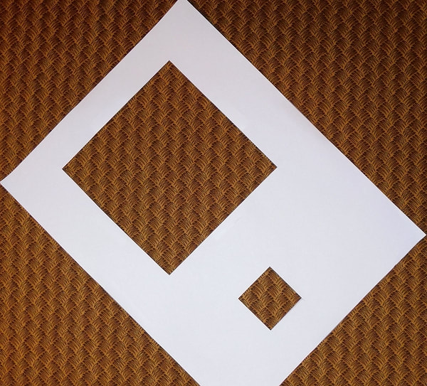
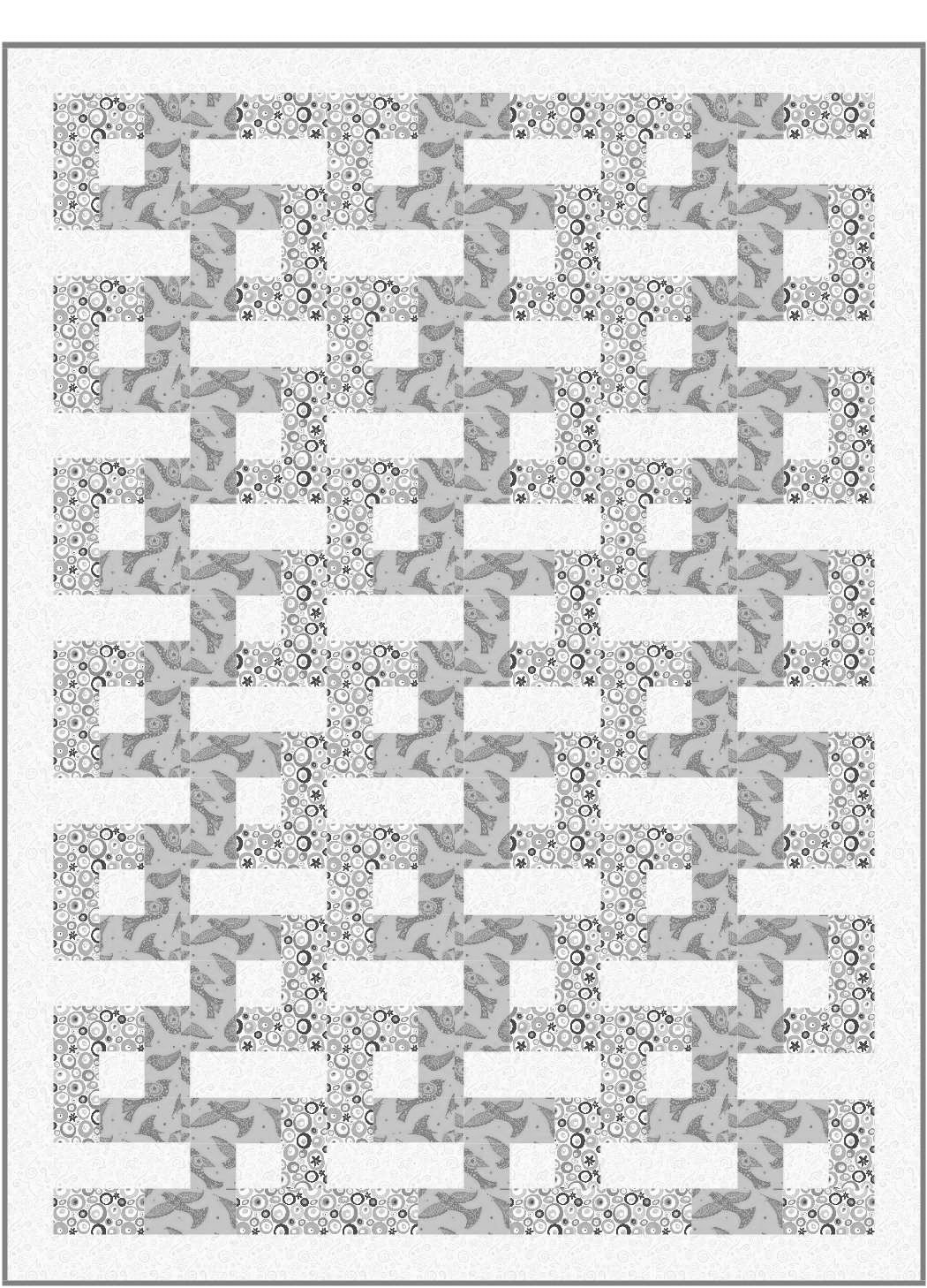
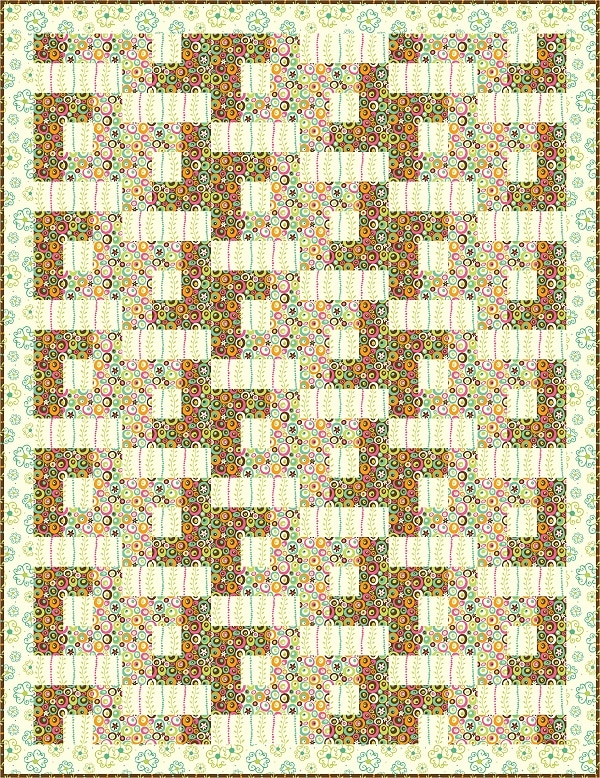
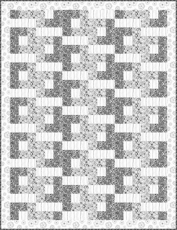
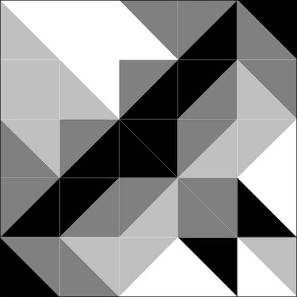
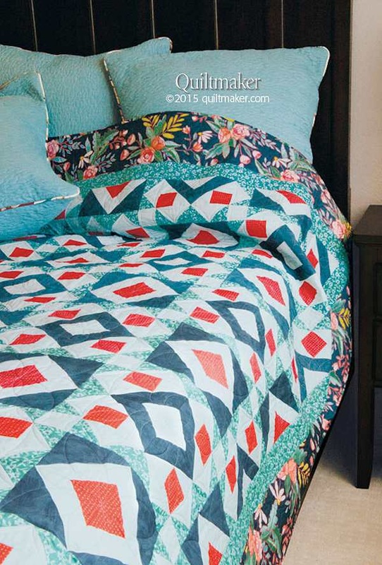
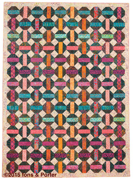
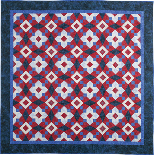
Let’s talk some more about scale. I knew that I would need to make up a baby quilt for a shower this past July. I decided to use this block, made at a larger size, for the quilt. My idea was that the block would be enlarged to 40” x 40”, which gave me a finished unit size of 5” x 5” for the square containing the stripe. Let’s go back and see what these fabrics would look like in a 5” square unit. I cut both a 5” and 1 ½” square so that you could see the difference between the two at the same time.
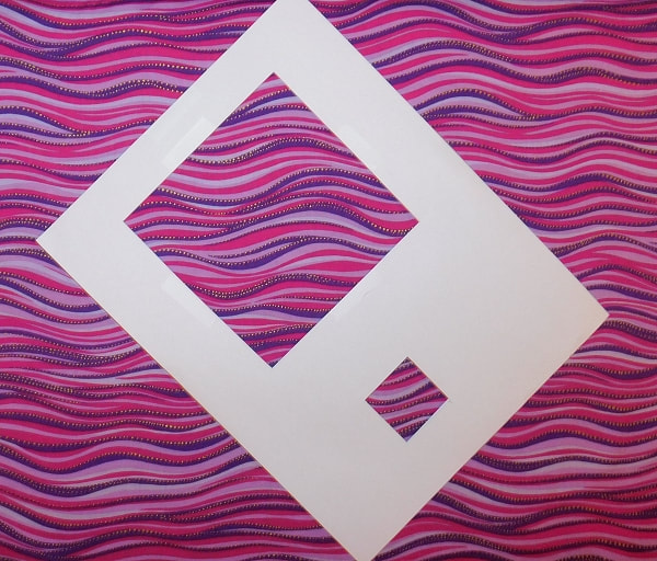
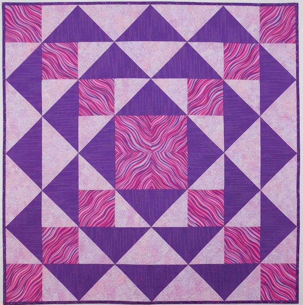
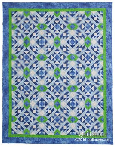
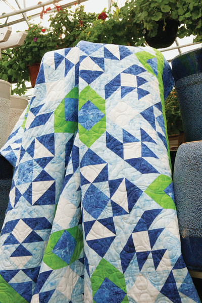
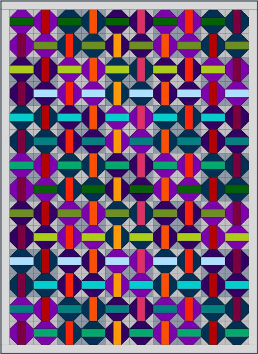
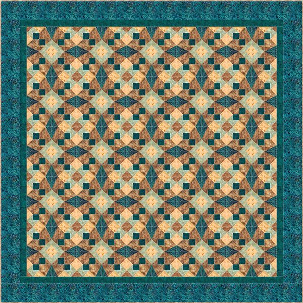
I decided to use the pink wavy stripe for the baby quilt. Even though it’s not a true linear image I thought it would make a funky quilt for a bay to stare at. I even did a mock up  of the quilt in EQ before making the quilt. Here they both are; the EQ representation and the finished quilt.
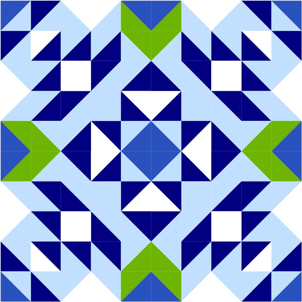
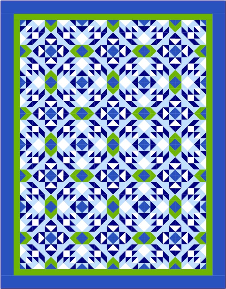
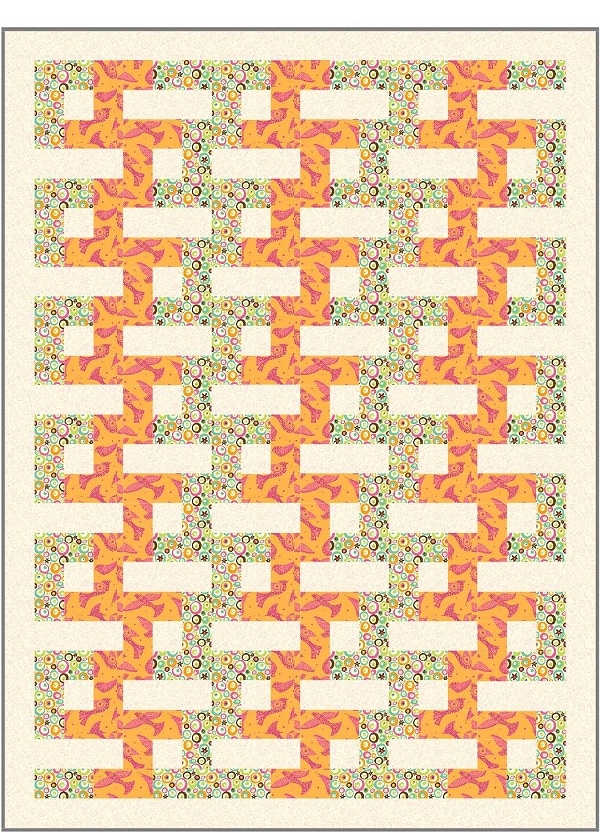
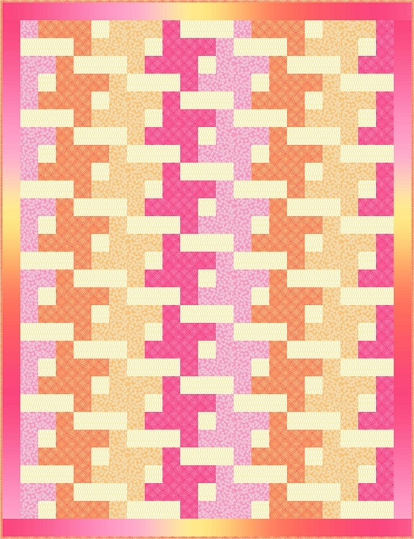
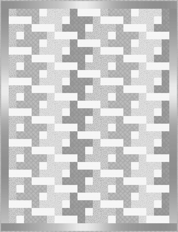
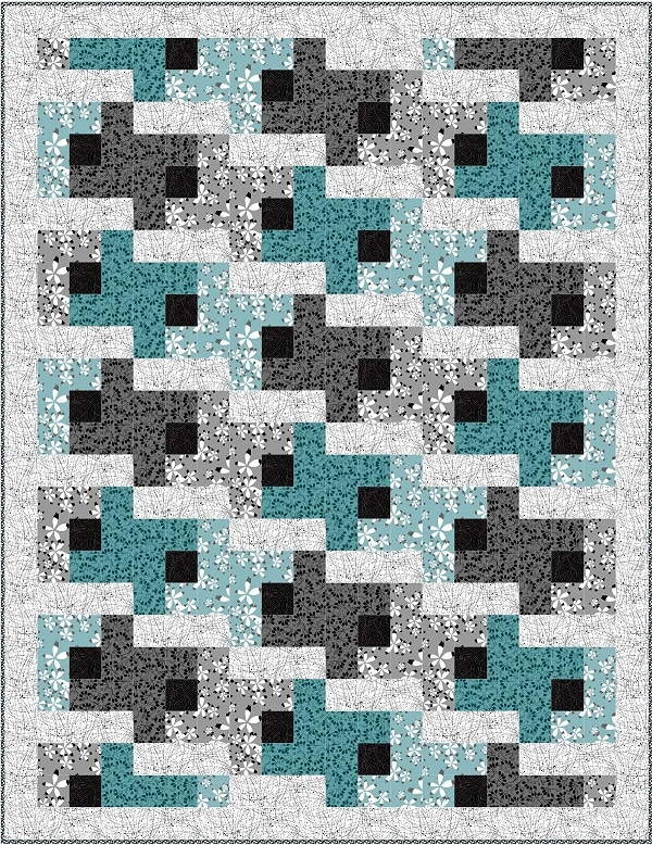
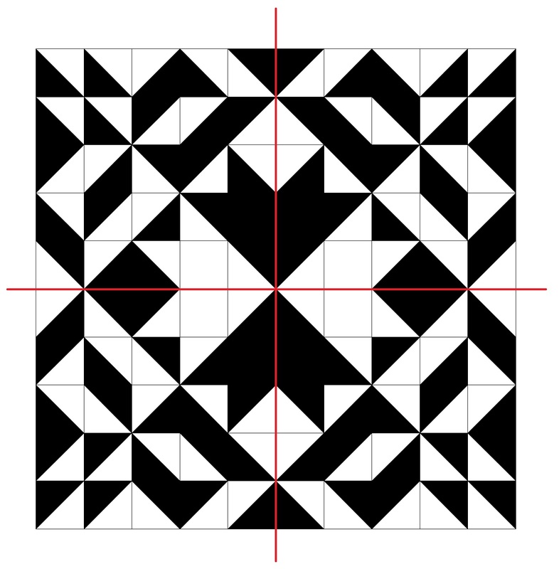
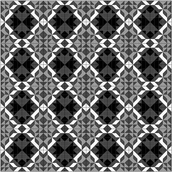
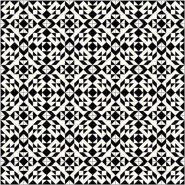
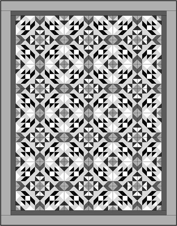
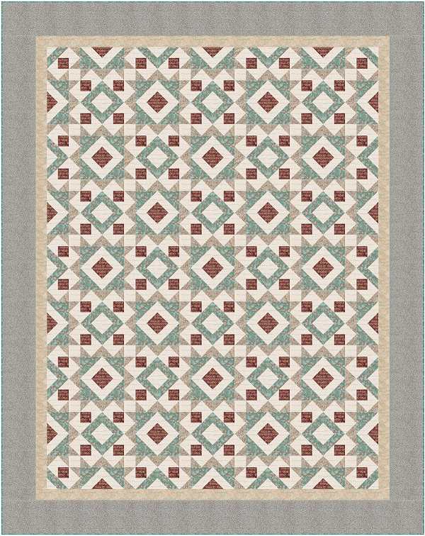
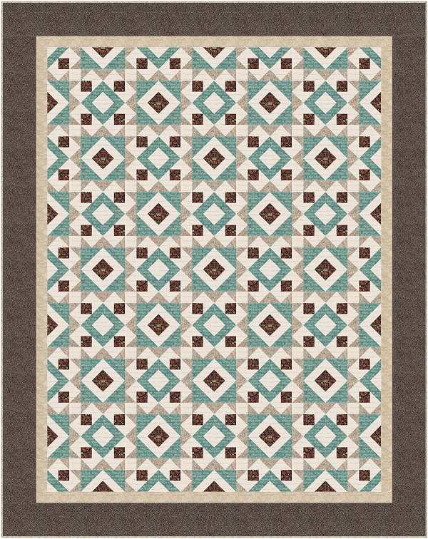
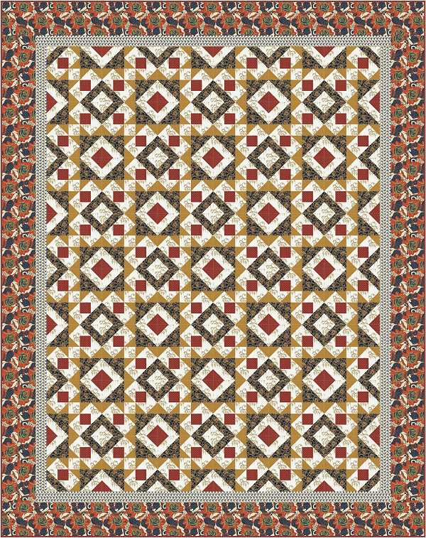
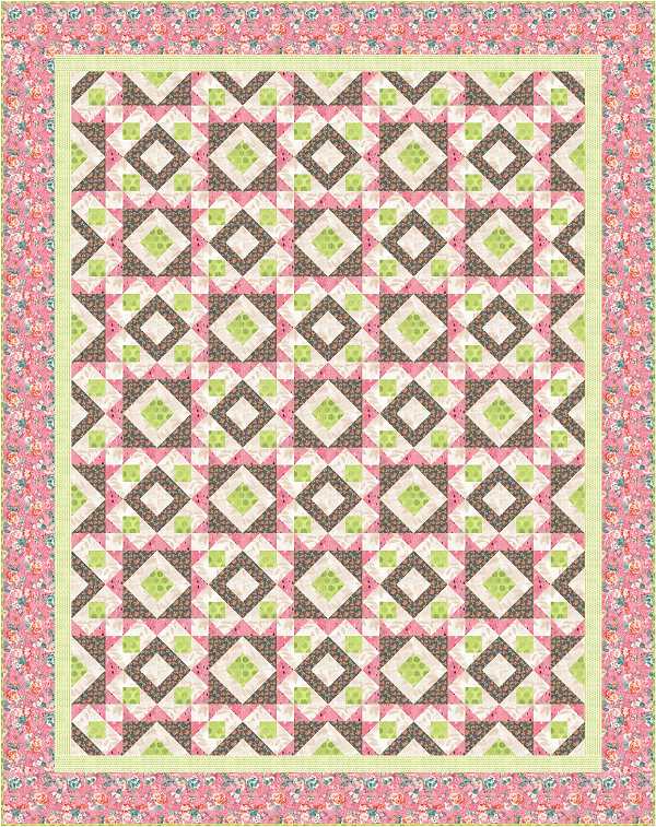
Alright now that we have gone over all the choices for the stripe and I’ve shown you the finished quilt, let’s talk about turning this into a rectangular quilt. If you add a row of Flying Geese across opposite ends of the quilt/block we end up with a lovely rectangular design. It’s just that easy!
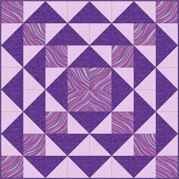
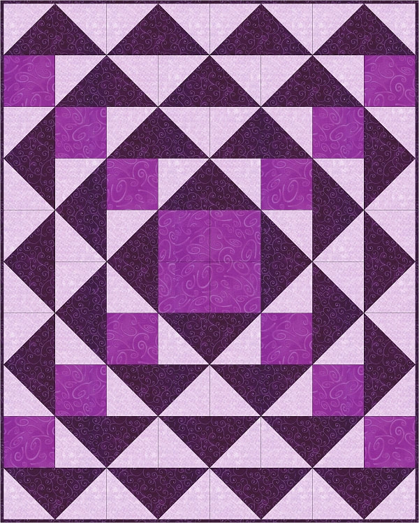
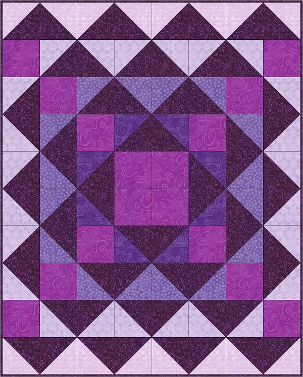
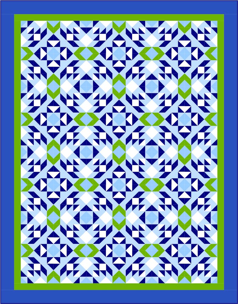
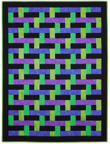
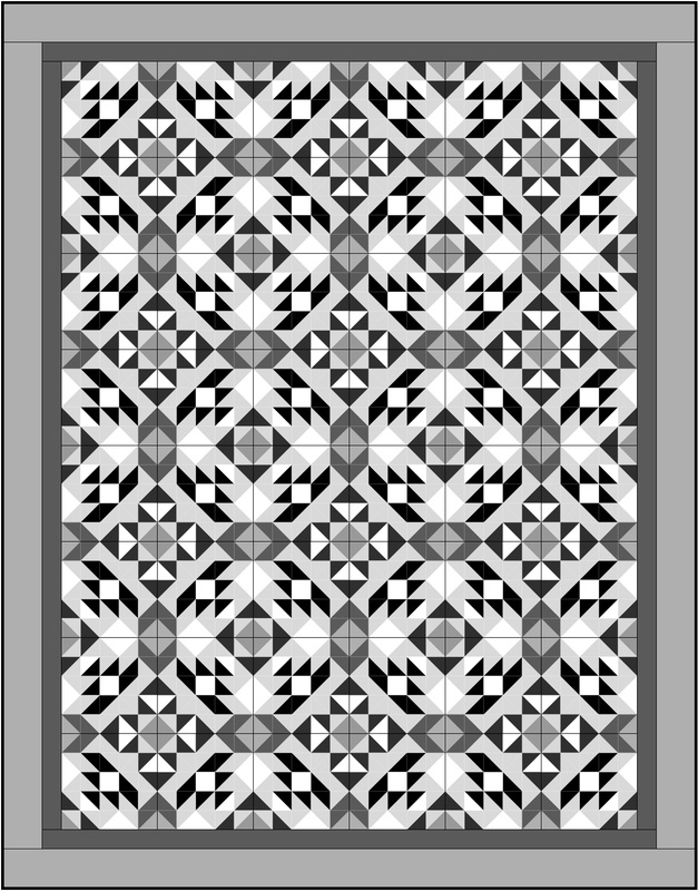
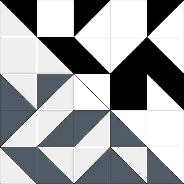
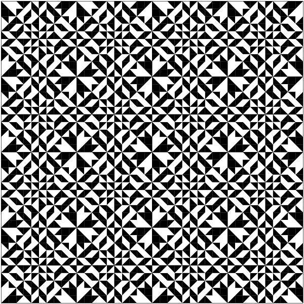
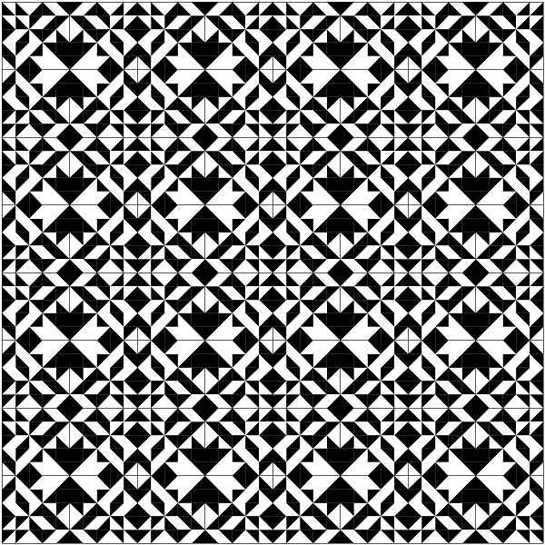
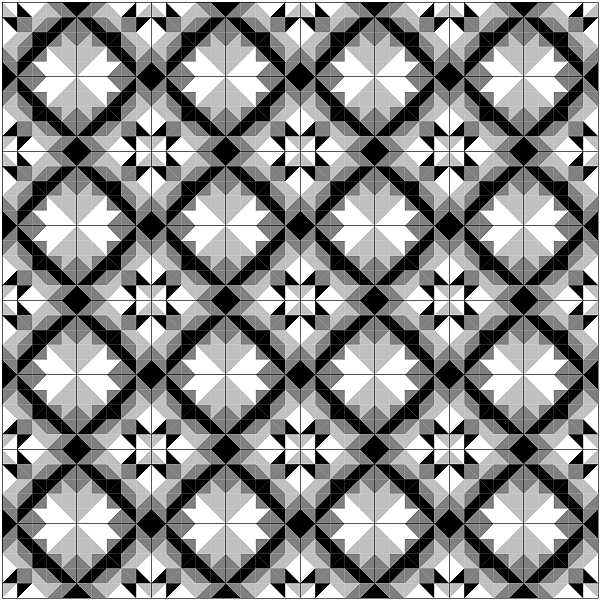
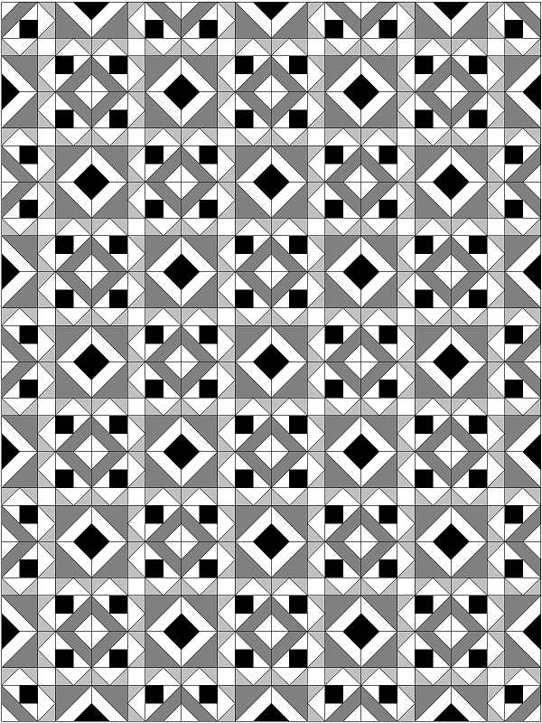
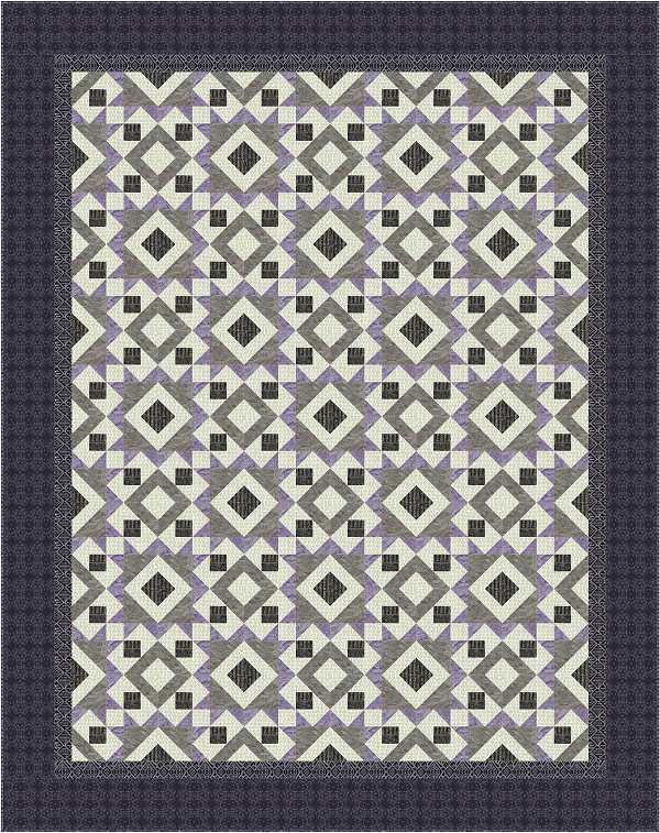
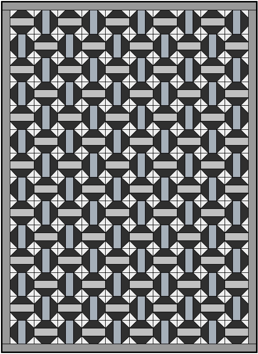
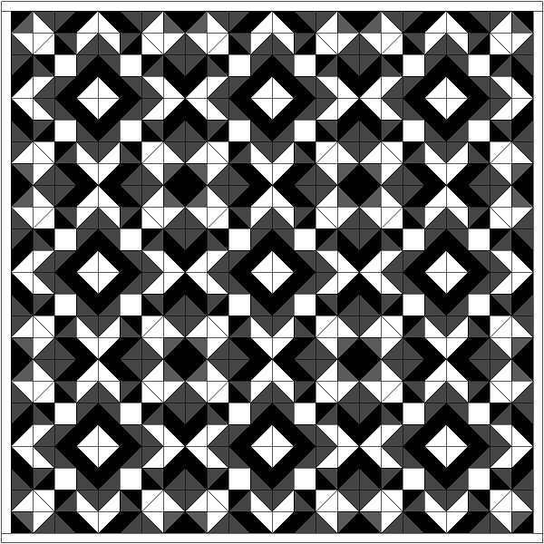
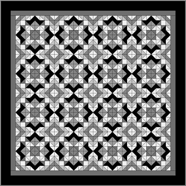
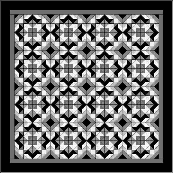
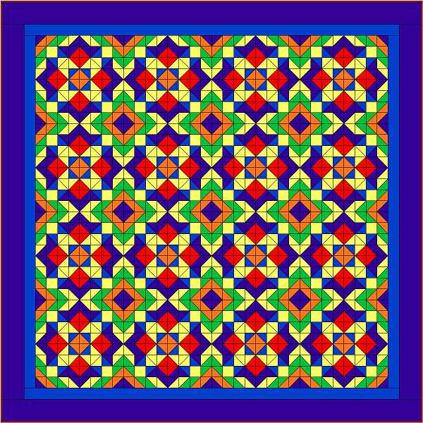
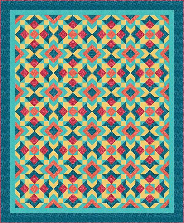
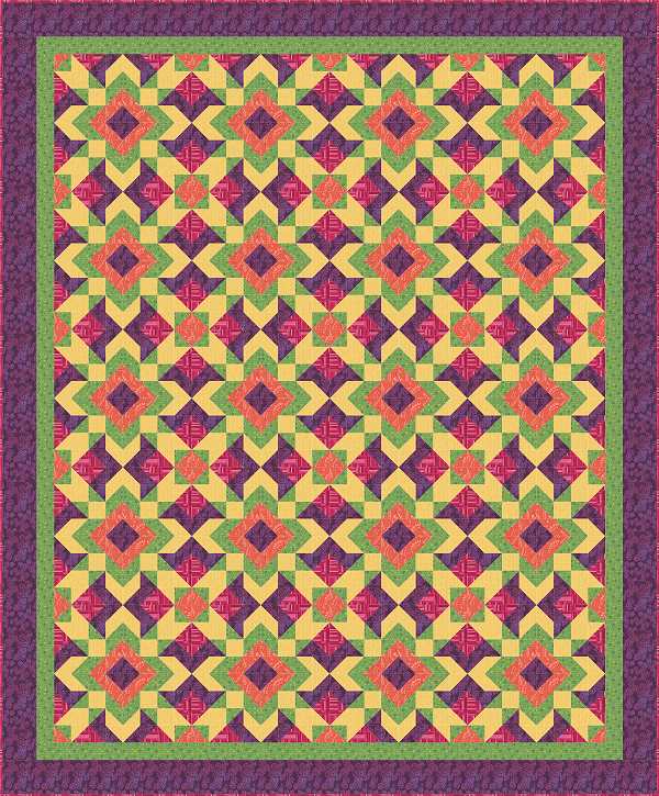
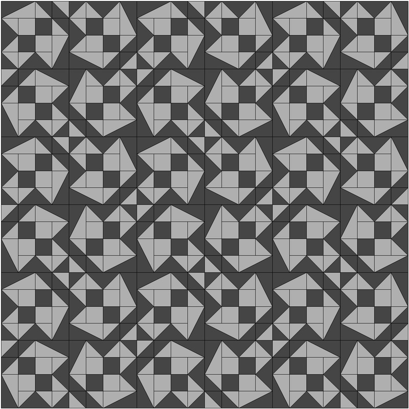
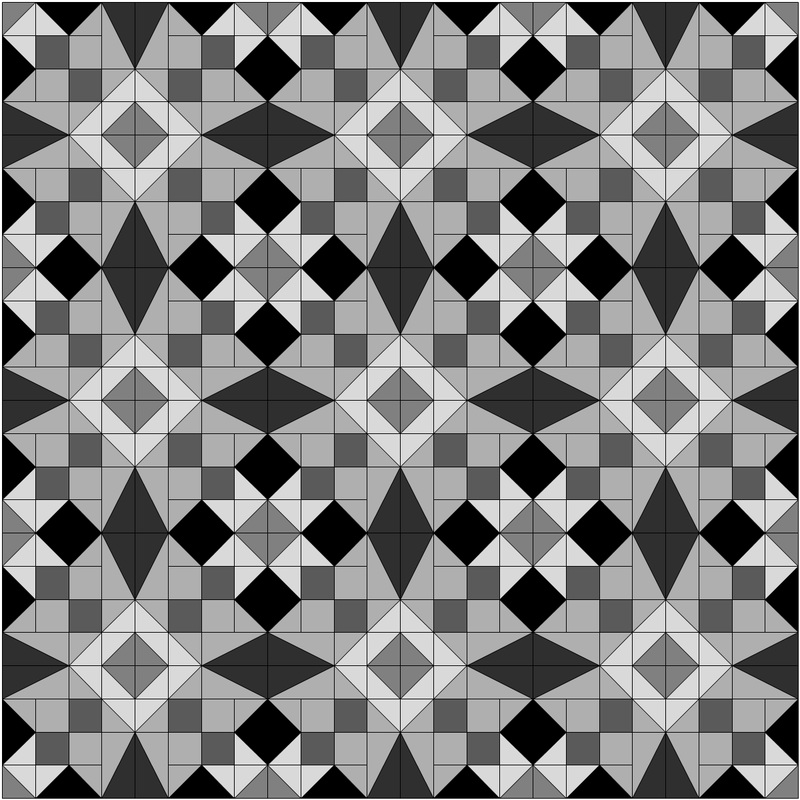
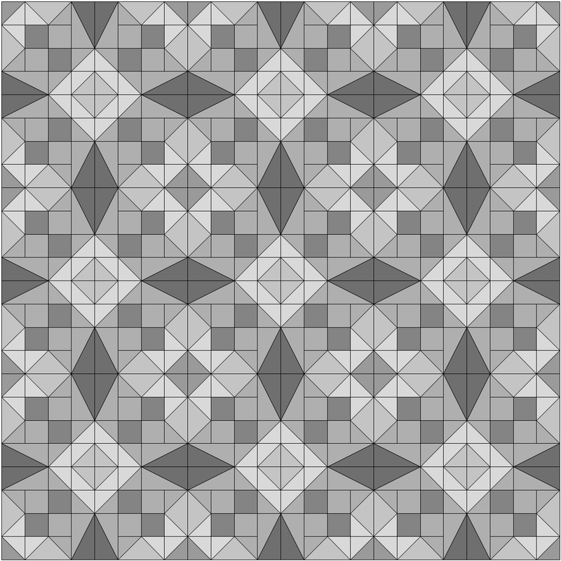
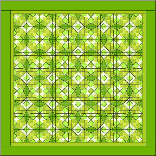
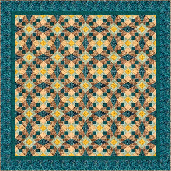
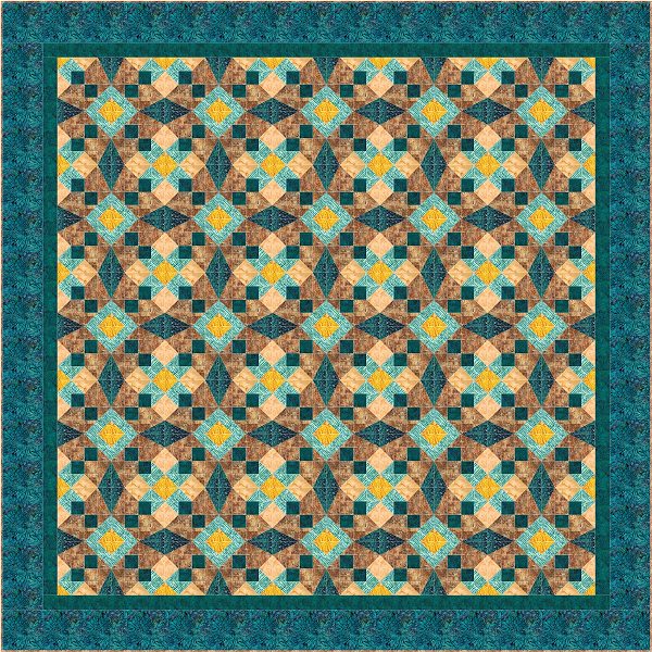
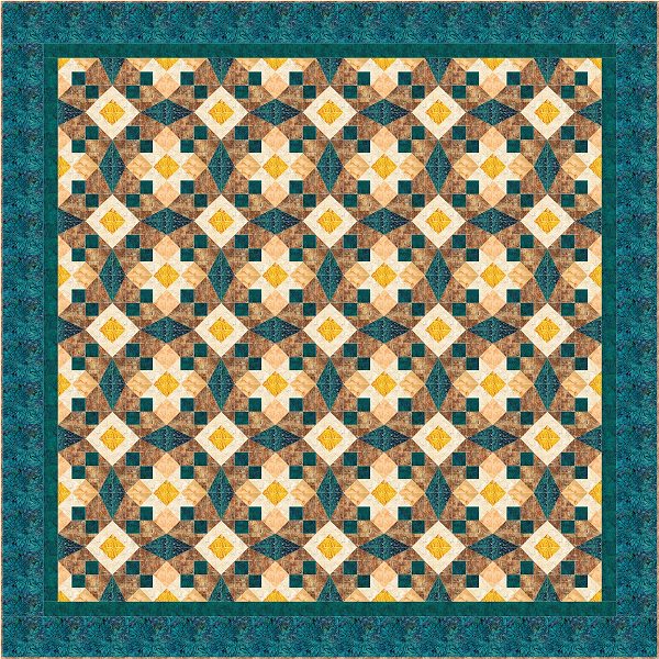
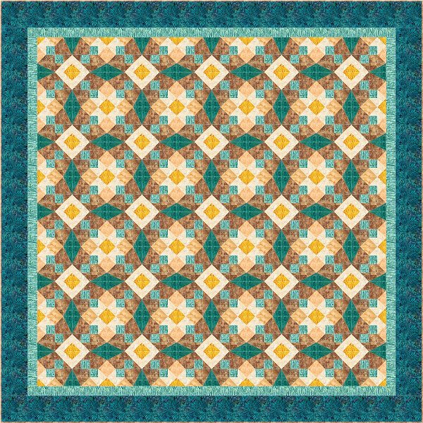
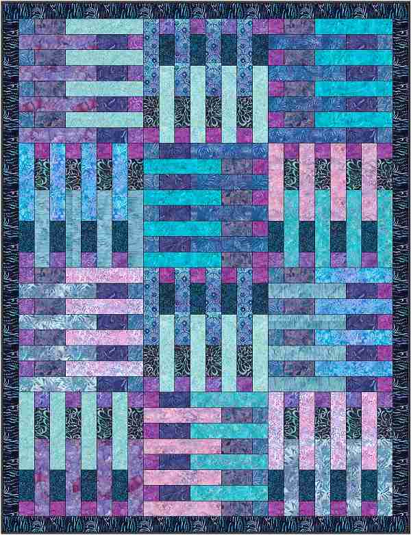
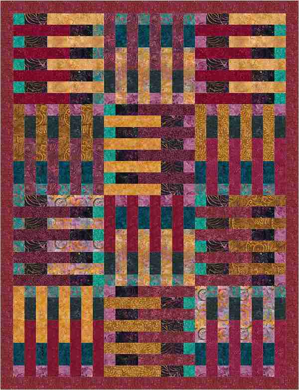
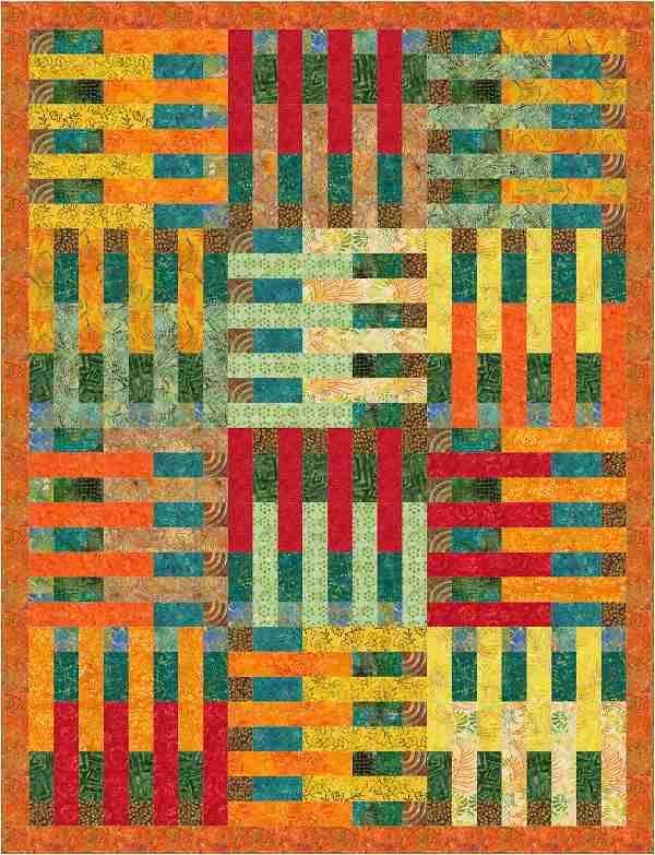
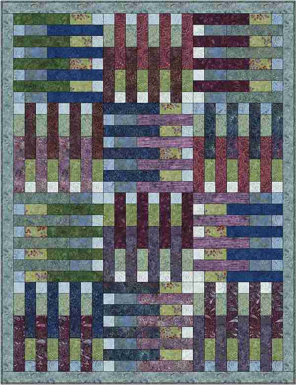
Now let’s travel a little farther down the road and see what else we can do with this design. Here is the design using a palette of purple tonals and blenders from the EQ library. The first design, starting on the left, uses just three values. If we add some gradient values of purple, for the wings of the geese, to the palette we can get a gradient affect starting with dark valued center and lighter values when we get to the outer edges. The last example shows the reverse gradient.
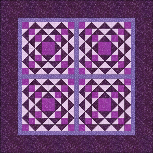
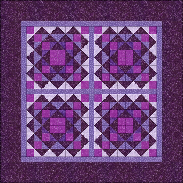
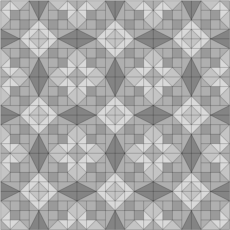
Alright, you have traveled with me this far, how about one more variation of what you can do with this block. Here’s a four block quilt shown in the purple palette. One has the three valued block and the other uses the gradient block option. Both quilts have sahing to set off the blocks.
Well, I hope you found this blog interesting. For a chance to win a copy of Quiltmakers 100 Block Challenge Volume 15, please leave me a comment below. Let me know how you feel about working with fabric cut on the bias or what you think of my post. I always try to respond to comments but there are so many during the blog tour that I don’t always accomplish my goal. So please forgive me in advance.

I’d also appreciate it if you would visit my Facebook page and click like. Also, please consider signing up for my email list. I promise that the email list is for my use only. I send out emails when I have something exciting to share with you, like a new blog post or a free pattern.
This offer has ended. Congratulations to Renee A.! Thank you for visiting! 

Happy Quilting, Janice


130 Comments

FREE PATTERN FRIDAY - OCTOBER 2017 - WHIRLPOOLS

10/20/2017

3 Comments

 
Hello Quilting Friends,

Here is the next offering for my special give away, Free Pattern Friday. I am offering this pattern for free and it will be available until I post the next one. Then it's gone! So make sure you get your copy.

You may also want to sign up for my mailing list. That way you’ll never miss an update to my blog. I promise never to sell your name to anyone. I will only ever use it to let you know about what’s going on at my website.

Here is this month’s free pattern, Whirlpools. This design was originally published in Quiltmaker magazine for May/June 2016. Click on either of the images below if you would like to read about how this design was developed.

In this blog I want to discuss value some more. I want to talk about why it’s important to have the right combination of fabrics values for your quilt design. By taking the extra time to find the right fabric values for your design you will be able to make a quilt that has the right amount of contrast between the light, medium and dark fabrics so that the finished design has the good visual movement.

If the values are too close between adjoining patch work pieces then the design will be washed out. You will lose part of the visual element that would have created the movement within your design. For the Whirlpools quilt design you need three values of Blue; light, medium and dark plus a green and a white accent. All three of the blue fabrics come in contact with each other therefore good contrast is very important. 

In the sample below we have the original block with the correct amount of contrast between the three blues. There is enough definition for you to see the visual movement that I desired. You can see new elements come to life when the blocks are joined and rotated.

Now let’s make the medium blue a bit lighter in value than it is and see what happens when we look at the quilt. As I see it, the loss of contrast between the medium and light blue patch work pieces affects the motif that is created at the center of four blocks when they are joined. As you can see the element isn’t as defined as it was when the medium blue was a deeper value. We also lose the dynamic between the medium blue and the green accent fabric.
If we make the medium blue even lighter, we completely lose the element where the four blocks join and therefore the reason for having a medium value in the first place. The same is true in relation to the pairing of the medium blue with the green accent. You almost can’t tell the light blue from the medium.
Here is a comparison of the three examples as you would see them in the finished quilt. This should drive home the importance of good value contrast.
There are tools that will help you to discern the value of a fabric. You need a color filter and a gray scale value card. The color filters come in green and red. You use the red filter when working with cool colors and the green when you are working with warm colors. Since most of us work with a combination of the two, you will probably want to have both filters.

As you look at the fabric through the filter you place the value card near the fabric and move it around the values until you find the one that matches yours. The great thing about working with these tools is that eventually you will start to discern the value of the fabric without the red or green filter. I have these tools available at my ETSY shop for purchase. Click here to visit my shop.
I hope you’re excited and feeling inspired by my post and the pattern I have offered you. I can’t wait to see what your version will look like! Please send me a photo of it when you have completed yours. And don’t forget to leave a comment. You can find the link for this pattern below.

Please share this pattern with your friends by giving them the link so that they can visit my website and download it themselves. I've worked hard to give you this gift, so I kindly ask that you do not copy this pattern in hard copy or as a digital file.

I hope you have a happy day full of quilting! Namaste my quilting friend, Janice


whirlpools_tile_5_directions_rev_3.pdf
File Size: 2121 kb
File Type: pdf
Download File

3 Comments

FREE PATTERN FRIDAY - JUNE 2017 - OVER UNDER QUILT DESIGN

6/16/2017

2 Comments

 
 Hello Quilting Friends,

Here is the next offering for my special give away, Free Pattern Friday. Once a month, on a Friday, I will make a pattern available as a free PDF download. The pattern will be available until I post the next one. Then it's gone! So make sure you download your copy today.
 
You may also want to sign up for my mailing list. That way you’ll never miss an update to my blog. I promise never to sell your name to anyone. I will only ever use it to let you know about what’s going on at my website.


This month’s design was originally created for Fons & Porter’s Easy Quilts fall 2014. If you’d like to read my original blog post for this design click here.
Picture
The original design was a 46” x 62” lap sized quilt. I decided to scale it down to a crib sized quilt measuring 40” x 54”. I got rid of the extra row of blocks across the length and width. I like this smaller size better. It feels like a better size for a small child to drag around. I feel that it’s important for a child to actually enjoy the quilt that a loved one made for them. Rather than having it hung on the wall as a decoration. Let me know what your feelings are on this subject, if you please.

When this design was originally published Fons & Porter deemed this design to be a great choice for their Quilts for Kids program because meets all of their guidelines. Plus it’s quick to make. The best part is that the yardages are relatively small. So you probably have all of the fabrics that you need in your stash. Better still because this design uses 2.5" wide units it's perfect for precuts!

I made a new version of this quilt for the daughter of a friend of mine. I invited him to choose the colors. He and his wife decided on green & purple. I decided to use black as the background color to set off the bright colors. My friend is a tattoo artist so I felt he and his wife would appreciate the avant-garde coloring of the baby quilt, which they did.

I want to show you how different this design can look when you change the value placement. Each of the following variations are shown with their corresponding greyscale value placement map. These maps will help you to identify what values you should use for each part of the block. They also will help show you how to arrange the blocks for each layout. The yardages shouldn't be too different but I would buy a little extra just to be safe.

I hope you’re excited and feeling inspired by this pattern I have offered you. I can’t wait to see what your version will look like! Please send me a photo of it when you have completed yours. And don’t forget to leave a comment. That way I know I’m not alone here. : )  
 
This pattern is available from download from my ETSY Shop. Click here to purchase this pattern.

I hope you have a happy day full of quilting! Namaste my quilting friend, Janice

2 Comments

New quilt Design "Spook-tacular" in Easy Quilts Magazine Fall 2016 from Fons & Porter

7/11/2016

1 Comment

 
I have exciting news to share with you. I have a new design in Fons & Porter’s Easy Quilts Fall 2016. Even more exciting, they are offering a kit for the design. I’ll tell you more about that in a little while. The name of the quilt pattern is Spook-tacular.
The fabric is from the Creepy Hollow collection by Quilting Treasures. It’s a fun group of fabrics featuring Halloween motifs in orange, purple, green and of course black. The group includes a panel of every Halloween related creature you could imagine; friendly ghosts, dapper pumpkins, dancing skeletons, big eyed spiders and smiling bats. I fell in love instantly and decided to try coming up with an appropriate design.
The construction for the final design is very basic. It utilizes two very traditional blocks; Shoo Fly and Monkey Wrench. These two blocks are alternated in a 4 x 5 block layout. These are surrounded by a beautiful border print. I used the remaining border print strips on the back of the quilt. I alternated the borders with a tonal fabric. I finished the ends with the tonal so that it would be trimmed off and not the lovely border.
One of my ideas was to use the border on two different tops or make one top the backing for the other. The border print only had two repeats across the width so I had to find a creative use for the remaining fabric borders.
Picture
Picture
I tried a couple of different ideas before sending them off to F&P to look at. They picked the one they liked best and the rest will live forever as a jpeg on my computer. But I’m going to show them to you first. I came up with one idea that utilized the panel and I tried another for the border print.
I hope you like it. If you make one, please send me a picture when you have the chance.
Happy Quilting!
1 Comment

New Design, Whirlpools, in Quiltmaker Magazine May/June 2016

4/3/2016

2 Comments

 
I have a new design in the May/June 2016 issue of Quiltmaker Magazine. The folks at Quiltmaker named the design Whirlpools. I think it’s a perfect name for the design because the rotation of the blocks creates the illusion of swirling water when you see it used in the quilt. I had given it the name Spinning Squash Blossoms, but I like their name better. Once again, Janice Roy of Bridgeport, Connecticut did the beautiful quilting. The lovely fabrics in this design are all from a few different Stonehenge collections by Northcott. After April 15, Quiltmaker will be offering this design in a kit and also the backing fabric sold separately.
The design for this quilt began with a sketch I made in my graph pad. For many of my recent designs I have been exploring 4 way rotational symmetry using blocks that have diagonal symmetry. That means that the block reflects as a mirror of the design along the diagonal division of a square. You can see this in the butterfly block below on the left.
When you place an object around a center point and rotate that object a set amount with each placement you have rotational symmetry. You can see this in the sample on the right below. Floor tiles use 4 way rotational symmetry and they are the inspiration for my design journey.
Below, on the left, you can see my original sketch for this design. As you can see from the final design on the right, this creation went through many iterations before I settled on the final manifestation of the design.
I’ll do my best to walk you through the development of this design. First I created a mockup of the original design in my Electric Quilt (EQ) design software. Even though the original block was designed with a strong diagonal element to the design, the block had no symmetry. To create symmetry I had to flip the block design to mirror itself. The horizontal and vertical red lines are the lines of symmetry.
After getting a look at the whole design using this block I knew I needed to tweak the block to make it simpler. I tried to isolate the elements that I liked in the original design that I liked. Below is a sample of the path this block design took. The first block is the original block design. I have colored the elements that I kept in grey tones so that you can see them within the original block.  For the next iteration of the block, I drew a diagonal line through the center unit of the 5 patch block. I did this to continue the diagonal line that already was developing through the block design. I shaded the resulting triangle in the lighter grey tone. My next idea was to color the block in reverse tones along the diagonal. Therefore the elements that are white on one side are now black on the other side and vice versa with the black elements.
Here is what the resulting block looked like in a tiled layout with rotational symmetry.
It made for a pretty cool design so I explored it further. I rotated the block and tried a mirrored or flipped symmetry in the layout.
I kind of liked the design a bit and decided to explore it a bit more. So I played with the value placement in the block to see what would develop.
Even though I was fond of the resulting design, I felt that I needed to head in a direction that would result in a simpler block to construct. Below are examples of this direction in the design development. I took the design back to the two tone stage where I use only black and white in the block coloring. I liked how this was starting to look and continued to alter elements in the block design.
I liked what I saw and decided to explore this iteration and add more grey tones to the block design. Eventually I came to the final iteration of the design, the last one on the right below, and I was satisfied.
I hope you were able to follow the path of how my mind works. I hope I didn't confuse you, because I sometimes confuse myself. Thank you for reading my post. I hope you enjoyed it!
 
Janice

2 Comments

New Quilt Design, Prairie Sky, in Quiltmaker Magazine January/February 2016

12/7/2015

0 Comments

 
I have a new design in the Quiltmaker magazine January/February 2016 issue. The quilt pattern is called Prairie Sky. The folks at Quiltmaker chose the name and I think it matches their fabric choice perfectly. I originally named it the “Owl Eyes” as the block looked like a large pair of eyes staring back at me.

 This design started as a doodle that I made while waiting for an appointment. Wherever you go, you should carry a sketch book with you. Try to find a small one that fits in your bag, as you never know when inspiration will catch up to you. I started by filing in the squares on the graph paper to create an interesting pattern. After sketching out a couple of repeats I looked for the base unit and marked with a couple of lines.

Picture
After I drafted the design into my Electric Quilt (EQ) program I colored it using only grey and black values for contrast. I next tried rotating the block in different ways to see what the design would look like. I decided I liked the original sketch best. After returning to the original version I toyed with adding different values and the placement of the values. Once I had the values and their placement decided I swapped the grey tones for a color.

Next I added borders to the blocks that supported the scale of the design. Then I went looking through my EQ Stash files for a fun collection to audition in this design. I found a number of current collections that I liked. In my EQ program I replaced the grey values with the new fabric choices. I think this design would look great in any type of fabric. If you make one please send me the images and I’ll post it on my web site.

0 Comments

New Quilt Design, Honeycomb, In Fons & Porter's Quilting Quickly September/October 2015 Issue

9/23/2015

0 Comments

 
I have a new quilt pattern in Fons & Porter's Quilting Quickly September/October 2015 issue. The design is called Honeycomb. The fabrics in the quilt are from Timeless Treasures Pashmina collection. The pattern can be made using precut 2 1/2" strips. Fons & Porter has a new twist for constructing the “snow ball” units. You can watch a demonstration of their technique, on You Tube. The design is being offered as a digital download from Fons & Porter or you can purchase a kit from Keepsake Quilting. Unfortunately the kits are on back order and won’t be available until October 13, 2015.
Picture
The inspiration for this design was the simple “Snow Ball” Block that we are all familiar with. I was looking for a new way of using this block so I broke out my trusty graph pad and proceeded to play. The first thing that came to my mind was to try rotating the units and create a larger block of four “Snow Balls”. The sketch below is the result.
Picture
Then I sat down and played with the idea in my Electric Quilt software. The first idea I had was to connect the units to create a visual flow across the quilt. The first two designs didn’t do it for me. They felt a little heavy handed so I thought I would try something a little more subtle. On my third try I felt that I was closer to a great design. But I didn’t love the way the grey tone values related to each other. So I switched around the grey values around and decided this was what I was looking for. Now it was time to tinker with color and create a woven effect.  
0 Comments

New Quilt Design, Rudeneja, in Quiltmaker Magazine September/November 2015 issue

8/14/2015

70 Comments

 
Yeah, I’m a cover girl! I have a new design in the September/November issue of Quiltmaker magazine and it’s on the cover. To celebrate, I want to give away a free copy of the issue. Leave a comment at the end of the article and you can win your free copy of this issue of Quiltmaker magazine. And if you haven’t already done so, I’d appreciate it if you could give me a “LIKE” on my Iris Quilts Facebook page. The giveaway ends September 18, 2015. Shortly after that, I’ll announce a winner.
The quilt is named RUDENEJA. It a Lithuanian word used to describe the way the weather feels as it turns to autumn. I’m not of Lithuanian descent but I love autumn. So can relate to the sensation. Looking at the finished quilt, I feel the folks at Quiltmaker gave it the perfect name.
I had the working name of Tile #4 for this design. The reason for that is because last summer and fall I had a great run of inspiration and designed a whole bunch of tiled designs. The best way for me to keep track of them was using numbers. This and all of my other ideas come from time I spend with my graphed sketch pad. It keeps me out of trouble…. most of the time.
Picture
I’ve been inspired by the designs found on decorative tiles. The designs typically have a diagonal line of symmetry. When placed in a grid pattern the tiles create a design that looks far more intricate than it actually is. It creates an illusion of many different block units used together to create the final design. Click here to see an earlier blog I posted about tile designs.

As I have done with my other designs, I come up with a block idea and then I sketch it out in a grid pattern to see what it looks like. For this design I started with the block rotated in one direction and then tried it out with the opposite rotation. When I’m happy with the result, I go to my Electric Quilt software to play with it some more. First I try the design out in black and white. Then I start to add dark greys to subtly contrast with the black. Once I see an interesting pattern, I then add lighter grey values to the design to make the design visually pop. About half way through the process I returned the blocks to their original rotation. I realized I liked it best that way.

Once I have a layout and a coloring that I like, I’ll try it in various fabric collections that I find in my Electric Quilt software. Here are a few.
Please take time to leave a comment below for a chance to win a free copy of this issue. Also, remember to visit my Facebook page and give me a “LIKE”, if you please.

Happy Quilting, Janice

70 Comments

New Quilt Design, Hero's Homecoming, in Quiltmaker magazine July/August 2015

6/15/2015

1 Comment

 
I have a new design in Quiltmaker Magazine’s July/August 2015 issue. The folks at Quiltmaker named the design a Hero’s Homecoming. I thought this was a great name for the quilt as shown in the magazine as it’s a Red, White & Blue quilt. Before that I was calling it Stormy Sea because of how the final design resembles a Storm at Sea quilt design. The funny thing is that I wasn’t even thinking of Storm at Sea while designing this. It was only after I decided upon the final value shading that I noticed. Once again, Janice Roy of Bridgeport, Connecticut did the beautiful quilting. Click on the underlined text for links to the magazine issue and quilt kit featuring this design.
This design started the way most of mine do; it came to me as I doodled while waiting for an appointment. I can’t stress enough how important it is to carry a sketch book with you everywhere you go. You never know when inspiration will catch up to you. I started by filing in the squares on the graph paper to create an interesting pattern. For me, the pattern started out looking a bit like a stylized dogwood blossom. After sketching out a couple of repeats I looked for the base unit and marked with a couple of lines. Then I sketched it in the corner for reference.
After I drafted the design into my Electric Quilt (EQ) program I colored it using only grey and black values for contrast. I next tried rotating the block in different ways to see what the design would look like. I decided I liked the original sketch best. After returning to the original version I toyed with adding different values and the placement of the values. Once I had the values and their placement decided I swapped the grey tones for a color.
Picture
Next I added borders to the blocks that supported the scale of the design. Then I went looking through my EQ Stash files for a fun collection to audition in this design. The collection that caught my eye was one from McKenna Ryan called Acres to Go. In my EQ program I sorted the fabrics in the collection by value and replaced the grey values with the fabrics. I tweaked the fabrics and their placements until I had a look that was pleasing to me. I think this design would look great in any type of fabric. If you make one please send me the images and I’ll post it on my web site.

1 Comment

New Quilt Design “Nutmeg & Cinnamon” in McCall’s Quilting July/August issue

6/2/2015

6 Comments

 
I have another new lap quilt design that I'd like to share with you. You can find it in McCall’s Quilting July/August 2015 issue. The design is named Nutmeg & Cinnamon. It’s made using “Spice Market” Tonga Treat precuts from Timeless Treasures. By the way, the beautiful quilting for this project was done by Janice Roy of Bridgeport, Connecticut. 
I own Electric Quilt (EQ) design software which gives me access to new fabric collections through their “Stash” downloads. I had purchased one of their stashes around the time that this idea came to me. I fell in love with the Timeless Treasures batik collections, so I did mock ups of this design using four other collections. Click on the images to enlarge.
Picture
The design was inspired by a doormat I saw that was made of links. You may have seen these in your travels.

I'm the guest blogger of the day on the McCall's Quilting Blog. They are posting an article about how I how I developed this idea into a quilt. It will also show you how I deal with color and value as part of the design process. Visit the blog and find out how to win a Spice Market Tonga Treat from Timeless Treasures just like the one used for the quilt. 

6 Comments
<<Previous
    Picture
    Picture

    Janice  Averill
    West Haven, Connecticut, United states

    Welcome to my Blog! This is where I'll share my thoughts about quilting with you. I'll post pictures and talk about designing quilts and construction techniques. I'll also post things that inspire me. Please leave a comment and let me know that you came by for a visit..

    Categories

    All
    100 Block Challenge
    Color Theory
    Connecting Threads
    Contests
    Ct Piecmakers Raffle Quilt
    Electric-quilt-lessons
    Electric Quilt Software
    Fabric Dyeing
    Fons & Porter Magazine
    Free Patterns
    Guild Workshops
    McCall's Quilts
    New Quilt From An Old Favorite
    Published Designs
    Quilter's Gallery
    Quilting Treasures Designs
    Quilting With Jose
    Quiltmaker Magazine
    Random Quilt Adventures
    Video Appearance

    RSS Feed

    Picture

    Archives

    October 2018
    November 2017
    October 2017
    August 2017
    June 2017
    May 2017
    April 2017
    February 2017
    November 2016
    July 2016
    June 2016
    May 2016
    April 2016
    March 2016
    December 2015
    November 2015
    September 2015
    August 2015
    July 2015
    June 2015
    May 2015
    April 2015
    March 2015
    February 2015
    January 2015
    December 2014
    November 2014
    October 2014
    September 2014
    August 2014
    July 2014
    June 2014
    May 2014
    April 2014
    March 2014
    February 2014
    January 2014
    December 2013
    November 2013
    October 2013
    September 2013

    Picture
    Picture
    Picture
    Picture
    Picture
    Picture
    Picture
    Picture
    Picture
    Visit the shops below for kits, fabrics, notions, patterns & magazines or anything else you might
    need to make a quilt.
    Picture
    Picture
    Picture

Proudly powered by Weebly