Hello Quilting Friends,
Here is the next offering for my special give away, Free Pattern Friday. I am offering this pattern for free and it will be available until I post the next one. Then it's gone! So make sure you get your copy. You may also want to sign up for my mailing list. That way you’ll never miss an update to my blog. I promise never to sell your name to anyone. I will only ever use it to let you know about what’s going on at my website.
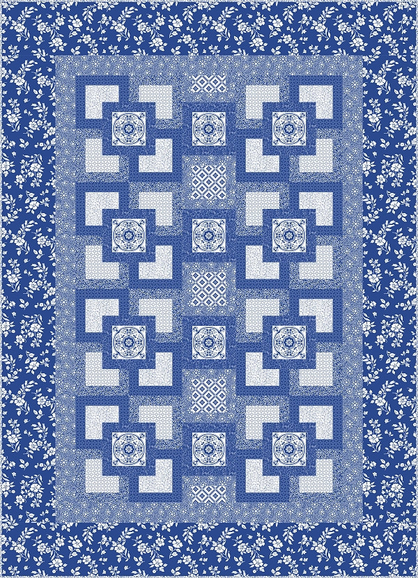
Here is this month’s free pattern, Blue Willow. This design was originally published in Fons & Porter's Love of Quilting March/April 2014 issue. In this blog I want to discuss the importance of value placement within your design. An understanding of value placement will help you to make a quilt that has the light, medium and dark fabrics where they need to be to achieve the look that you desire.
Here is the next offering for my special give away, Free Pattern Friday. I am offering this pattern for free and it will be available until I post the next one. Then it's gone! So make sure you get your copy. You may also want to sign up for my mailing list. That way you’ll never miss an update to my blog. I promise never to sell your name to anyone. I will only ever use it to let you know about what’s going on at my website.
Here is this month’s free pattern, Blue Willow. This design was originally published in Fons & Porter's Love of Quilting March/April 2014 issue. In this blog I want to discuss the importance of value placement within your design. An understanding of value placement will help you to make a quilt that has the light, medium and dark fabrics where they need to be to achieve the look that you desire.
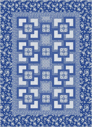
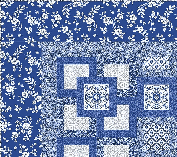
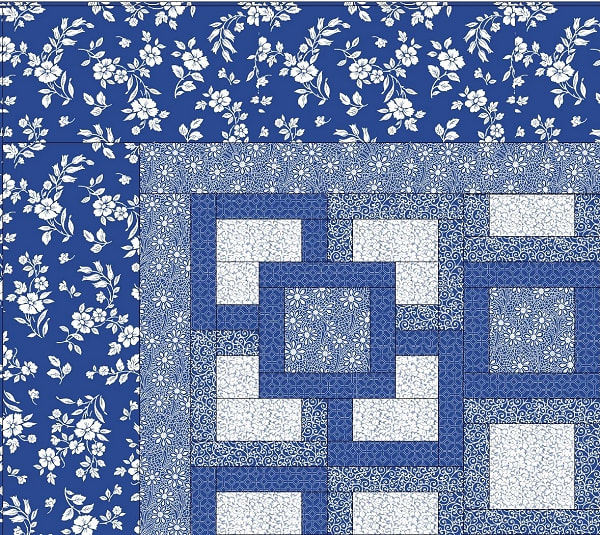
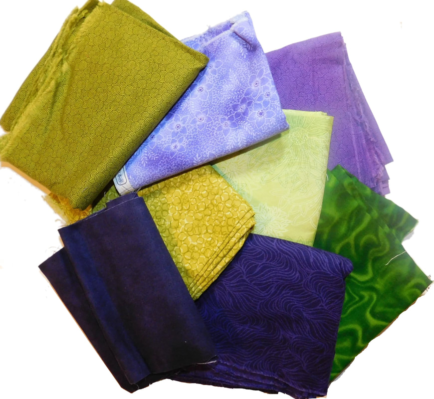
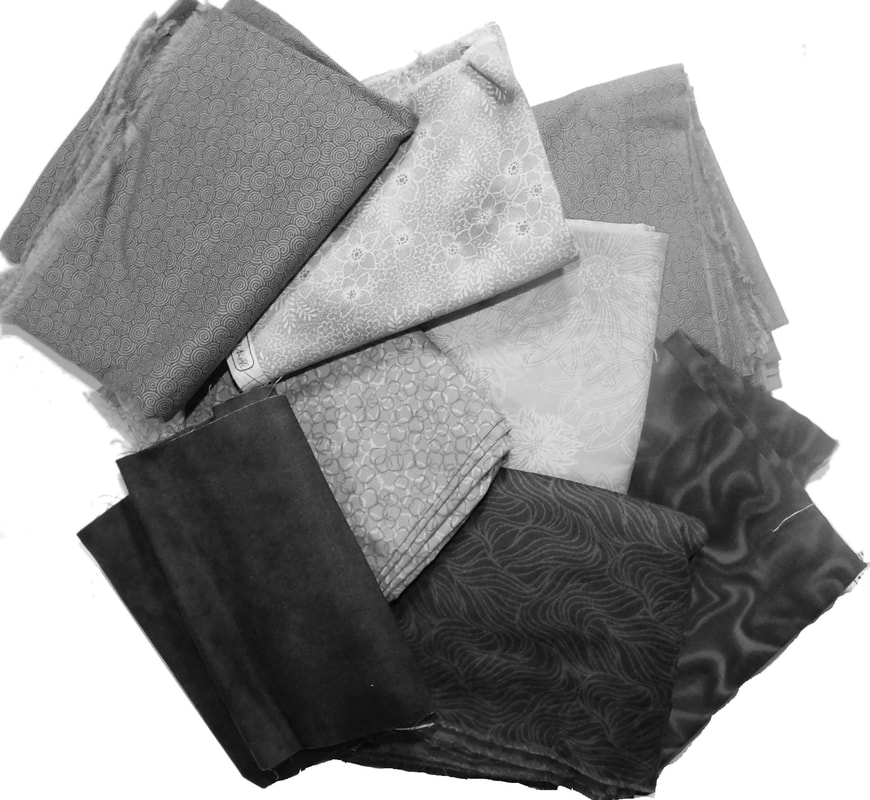
This quilt was made with fabric from Quilting Treasures Blue Moon collection. This group was great to work with because it consisted of a full scale of 10 values from light to dark. This was accomplished through the clever distribution of the texture used in the motif of each fabric print. The visual texture was achieved with blue printed onto white fabric.
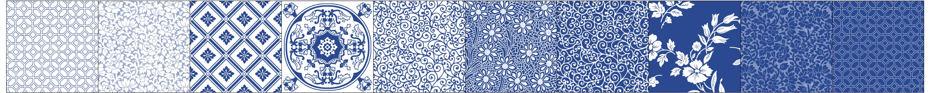
Usually I work with a standard grey scale progression from black through a variety of greys to white when I design. Whenever I work on a new design I always consider value placement carefully. The placement of light and dark is what creates the pattern that our eyes perceive. I can’t stress enough how wonderful it was to work with a group of fabrics where someone took the time to create a near perfect progression of printed fabric textures ranging from light to dark.
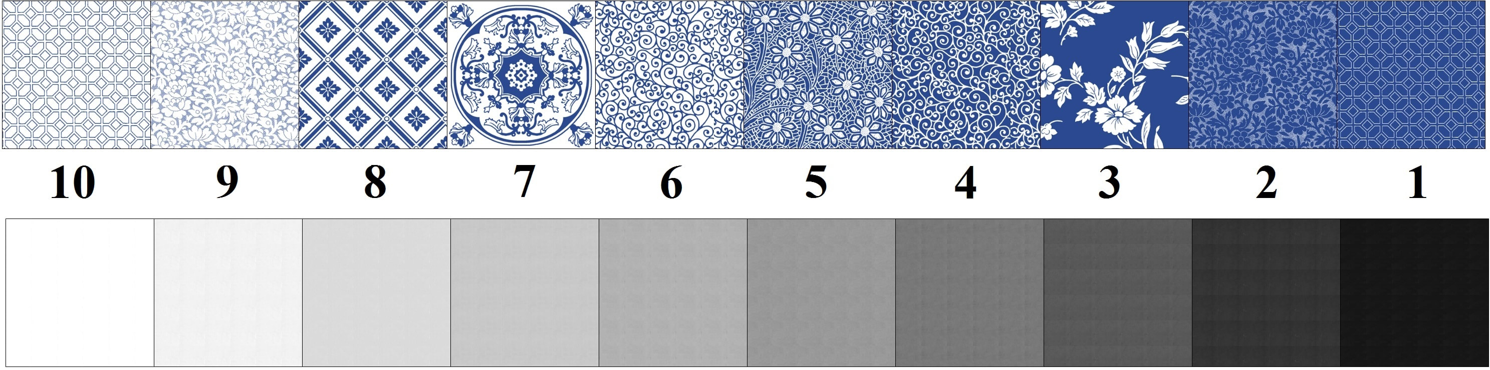
For this design I used 10 values (10 fabrics) in total. It may seem like a lot of fabrics to gather together, but when you see what it looks like with less values you’ll understand why you will want to take the time to collect all the values you’ll need to complete this quilt as designed. I’ll go through a few variations where I decrease the number of fabrics used so that you can understand how more values (fabrics) can improve the look of a design.
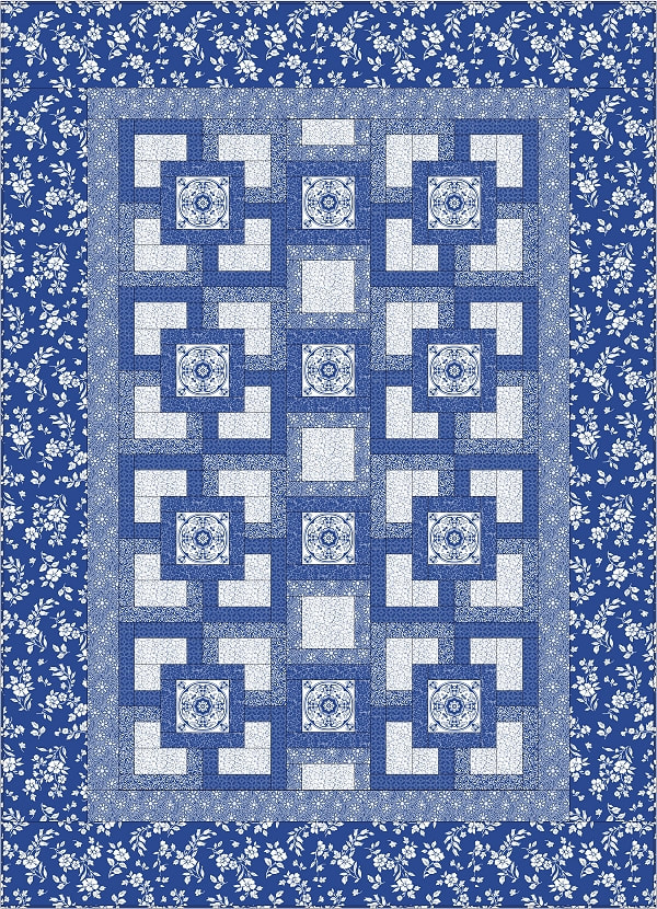
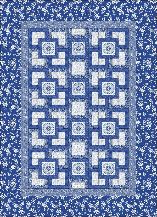
The original design uses 10 values. I’ll start by changing the binding to match the last border. It may seem like a little thing to change but having a binding that contrasts with the last border adds a nice accent to the overall design. The next thing I’ll tweak are the light valued fabrics. In this design there are three light valued fabrics. I’m going to replace two of them with the third. This results in a design that uses 7 different values. Here is a look at both the original design and the new variation. I’ve also included a close up for detail.
The original design uses 10 values. I’ll start by changing the binding to match the last border. It may seem like a little thing to change but having a binding that contrasts with the last border adds a nice accent to the overall design. The next thing I’ll tweak are the light valued fabrics. In this design there are three light valued fabrics. I’m going to replace two of them with the third. This results in a design that uses 7 different values. Here is a look at both the original design and the new variation. I’ve also included a close up for detail.
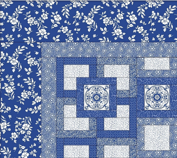
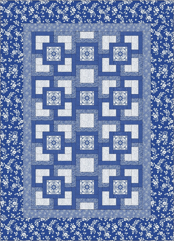
Next I’ll tinker with the medium values used in the interior of the quilt. There is a swirl and a floral used to frame the light value portions. I’m going to change the floral one to match the swirl. I’m still using the floral in the border but not the interior. This creates a flatter image. The depth created by the use of the second medium valued fabric is missing. Here is the result below.


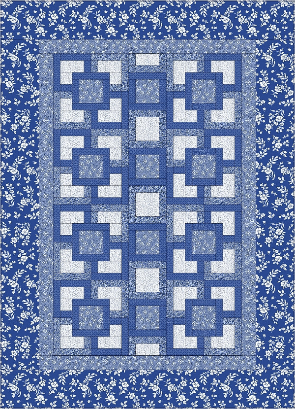
The design has two dark fabrics used in the blocks that create depth just like the medium valued fabric did. I’m going to remove the second dark fabric and use only one dark fabric in the design. We are now down to 7 values used in the interpretation of this design. Here is what that looks like.


Finally I’ll change the tile motif in the middle of the block to match the inner border. Now we are down to 6 values used in the design. I think that the design loses some of its sparkle when the palette is pared down to almost half of the number we started with. Here’s the result. You can decide for yourself how it makes you feel when less fabrics are used to interpret the design.


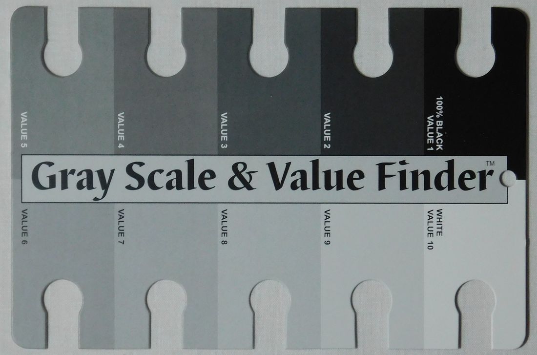
There are tools that will help you to discern the value of a fabric. You need a color filter and a gray scale value card. The color filters come in green and red. You use the red filter when working with cool colors and the green when you are working with warm colors. Since most of us work with a combination of the two, you will probably want to have both filters.
As you look at the fabric through the filter you place the value card near the fabric and move it around the values until you find the one that matches yours. The great thing about working with these tools is that eventually you will start to discern the value of the fabric without the red or green filter. I have these tools available at my ETSY shop for purchase. Click here to visit my shop.
As you look at the fabric through the filter you place the value card near the fabric and move it around the values until you find the one that matches yours. The great thing about working with these tools is that eventually you will start to discern the value of the fabric without the red or green filter. I have these tools available at my ETSY shop for purchase. Click here to visit my shop.

I hope you’re excited and feeling inspired by this pattern I have offered you. I can’t wait to see what your version will look like! Please send me a photo of it when you have completed yours. And don’t forget to leave a comment. That way I know I’m not alone here. : )
This pattern is available from download from my ETSY Shop. Click here to purchase this pattern.
I hope you have a happy day full of quilting! Namaste my quilting friend, Janice
This pattern is available from download from my ETSY Shop. Click here to purchase this pattern.
I hope you have a happy day full of quilting! Namaste my quilting friend, Janice
 RSS Feed