Hello Quilting Friends,
Here is the next offering for my special give away, Free Pattern Friday. I am offering this pattern for free and it will be available until I post the next one. Then it's gone! So make sure you get your copy.
You may also want to sign up for my mailing list. That way you’ll never miss an update to my blog. I promise never to sell your name to anyone. I will only ever use it to let you know about what’s going on at my website.
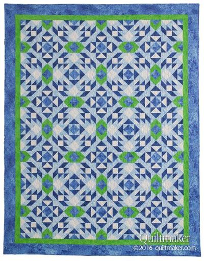
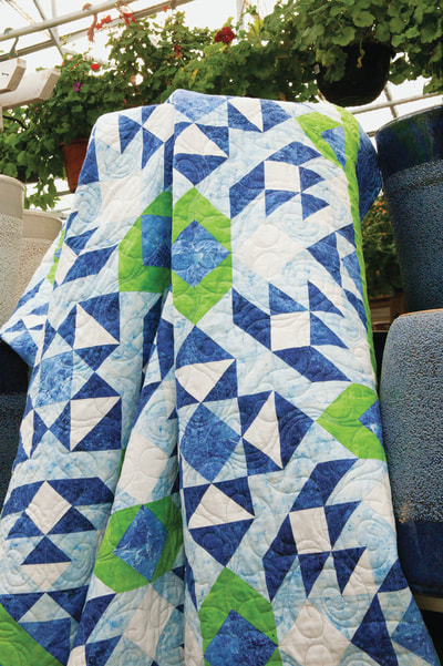
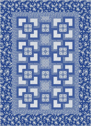
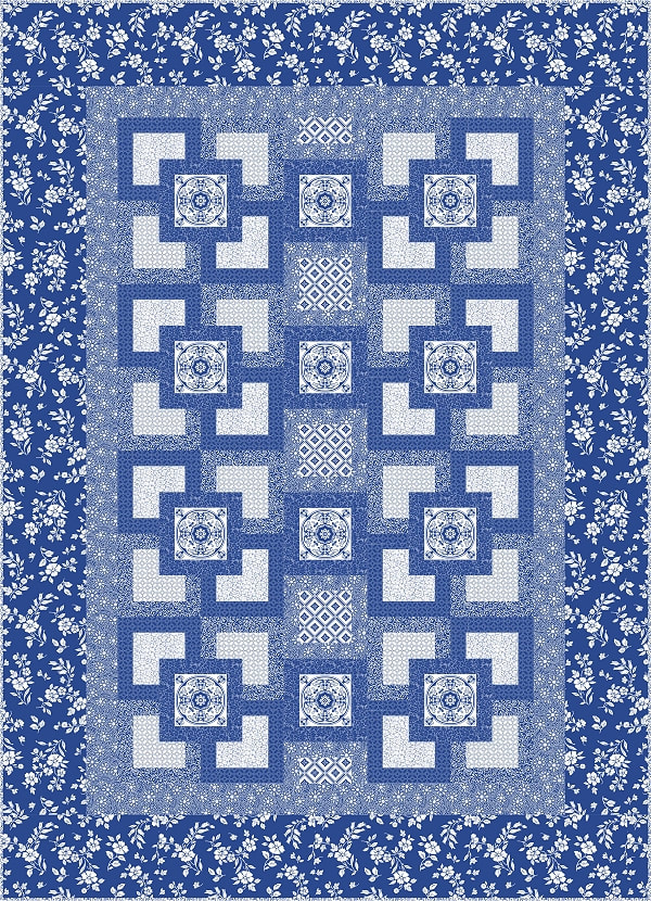
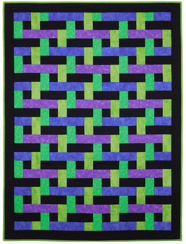
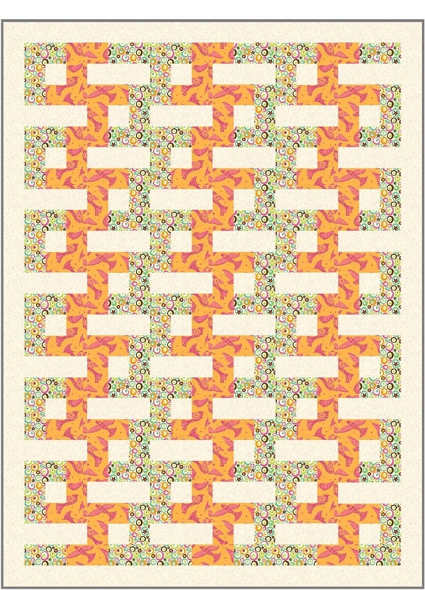
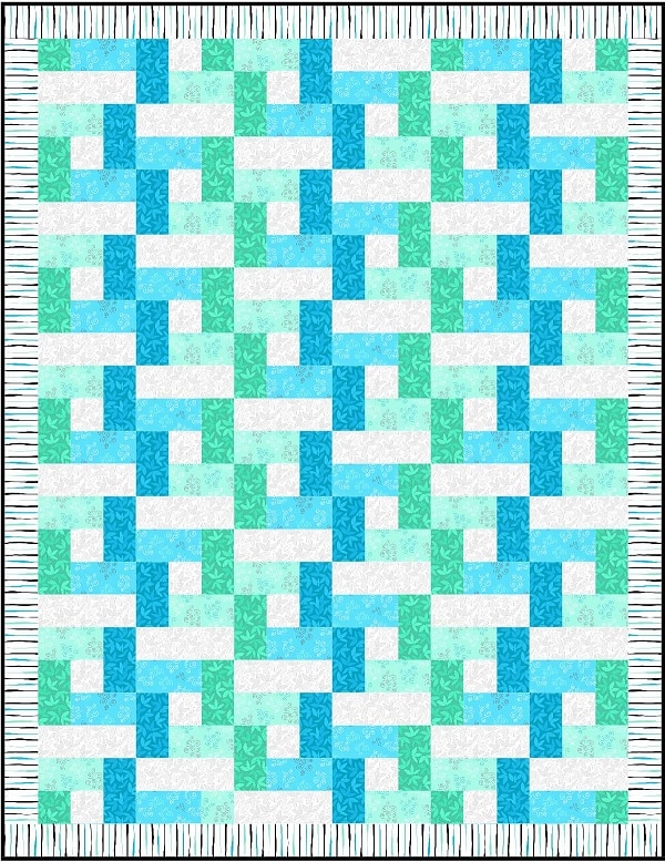
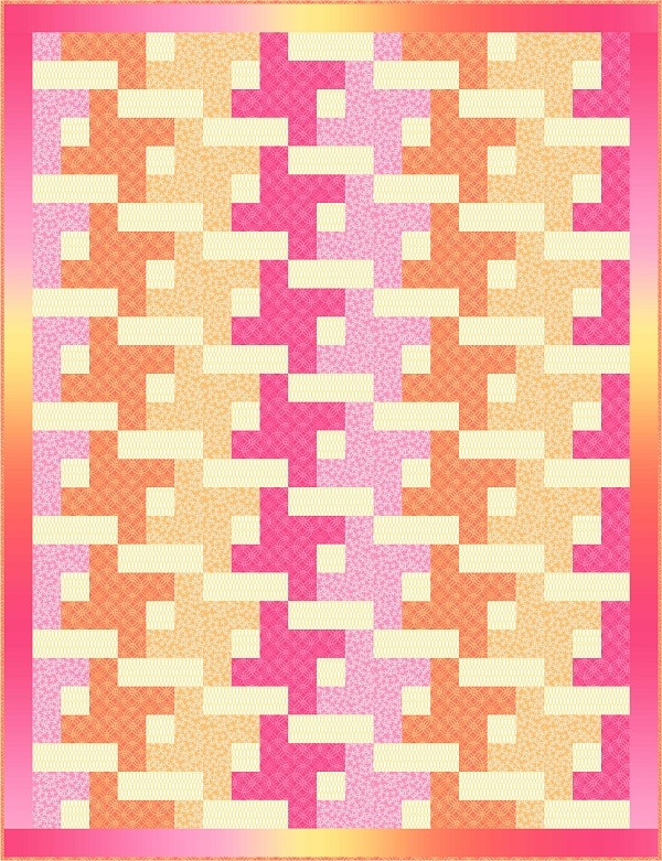
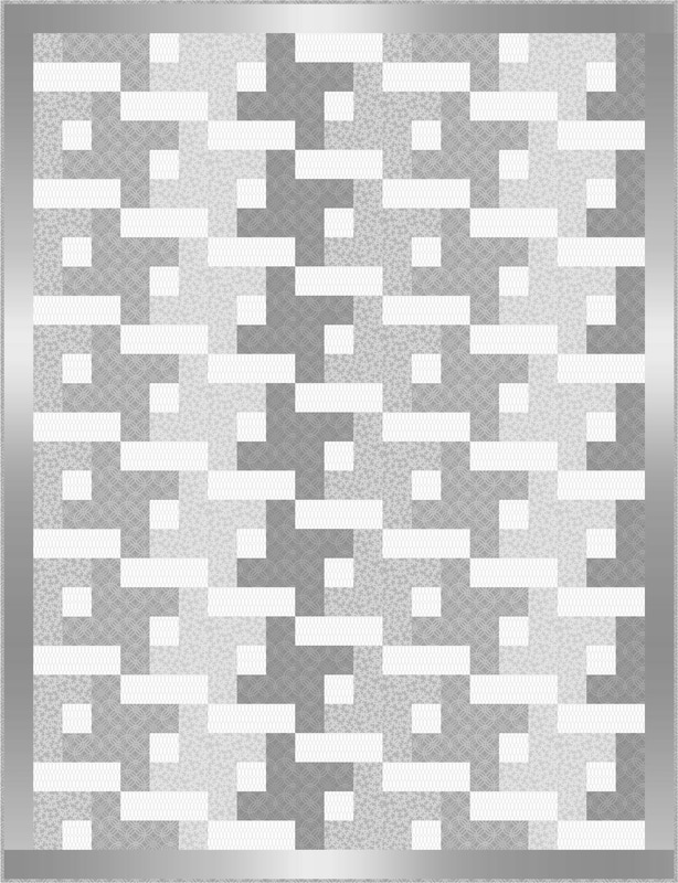
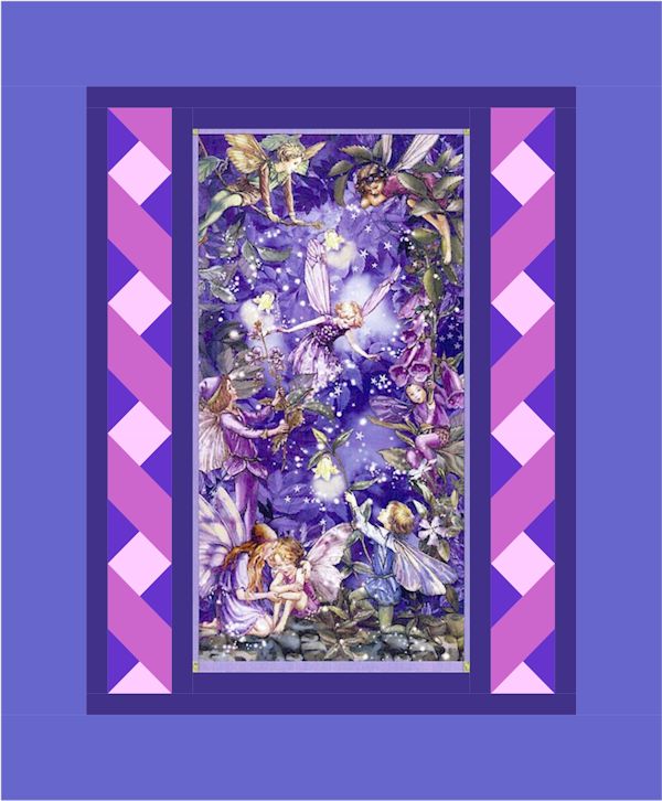
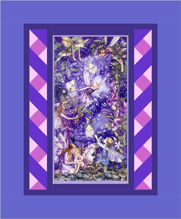
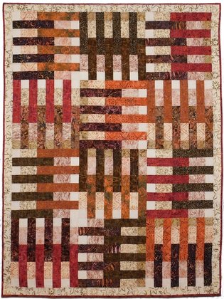
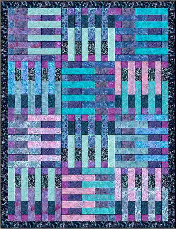
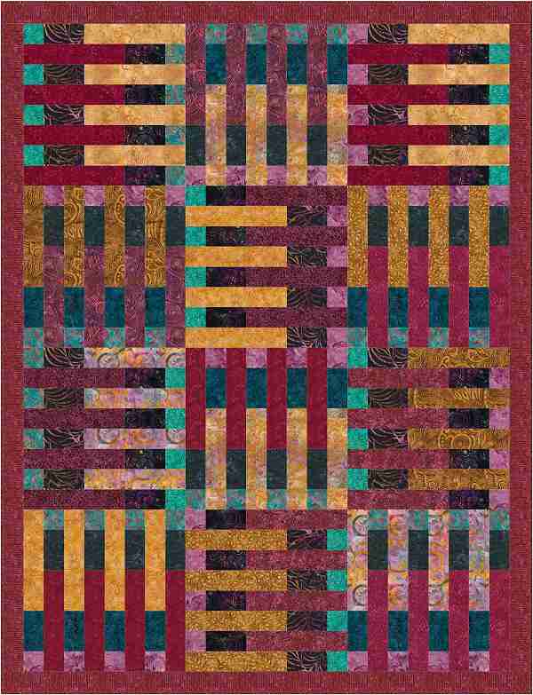
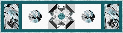
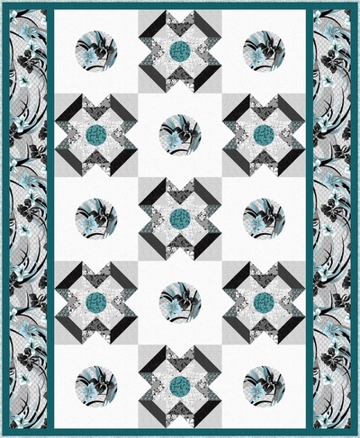
Here is this month’s free pattern, Whirlpools. This design was originally published in Quiltmaker magazine for May/June 2016. Click on either of the images below if you would like to read about how this design was developed.
Here is the next offering for my special give away, Free Pattern Friday. I am offering this pattern for free and it will be available until I post the next one. Then it's gone! So make sure you get your copy.
You may also want to sign up for my mailing list. That way you’ll never miss an update to my blog. I promise never to sell your name to anyone. I will only ever use it to let you know about what’s going on at my website.
Here is this month’s free pattern, Whirlpools. This design was originally published in Quiltmaker magazine for May/June 2016. Click on either of the images below if you would like to read about how this design was developed.
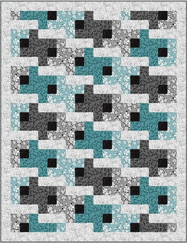
In this blog I want to discuss value some more. I want to talk about why it’s important to have the right combination of fabrics values for your quilt design. By taking the extra time to find the right fabric values for your design you will be able to make a quilt that has the right amount of contrast between the light, medium and dark fabrics so that the finished design has the good visual movement.
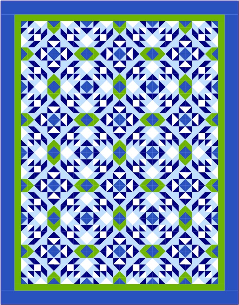
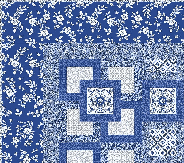
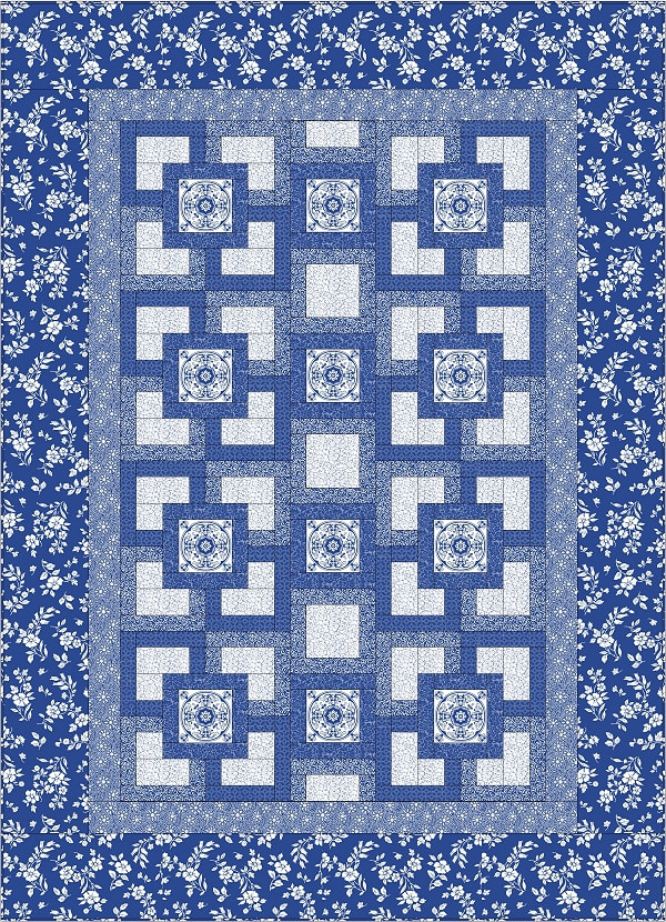
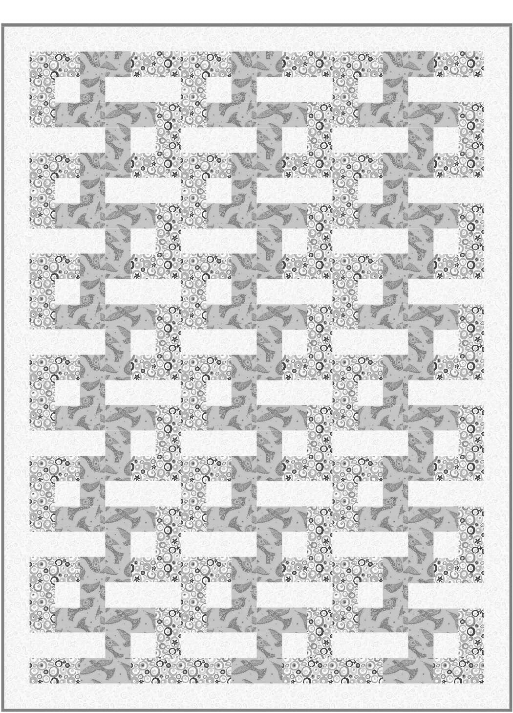
If the values are too close between adjoining patch work pieces then the design will be washed out. You will lose part of the visual element that would have created the movement within your design. For the Whirlpools quilt design you need three values of Blue; light, medium and dark plus a green and a white accent. All three of the blue fabrics come in contact with each other therefore good contrast is very important.
In the sample below we have the original block with the correct amount of contrast between the three blues. There is enough definition for you to see the visual movement that I desired. You can see new elements come to life when the blocks are joined and rotated.


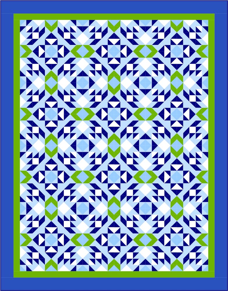
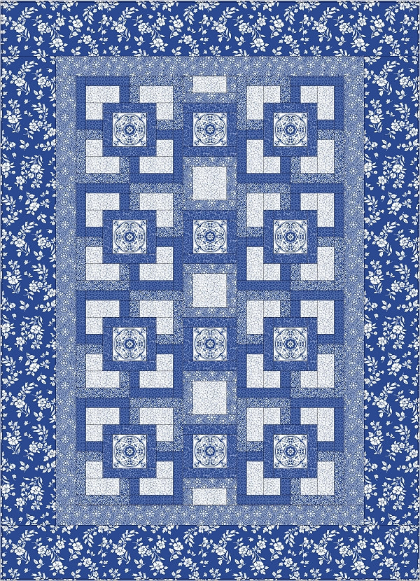
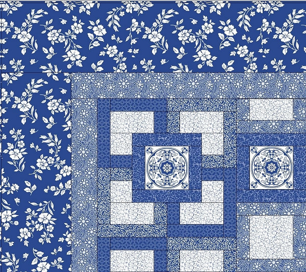
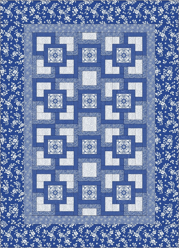
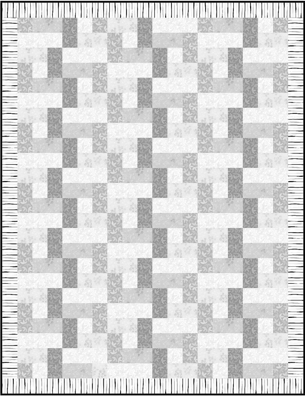
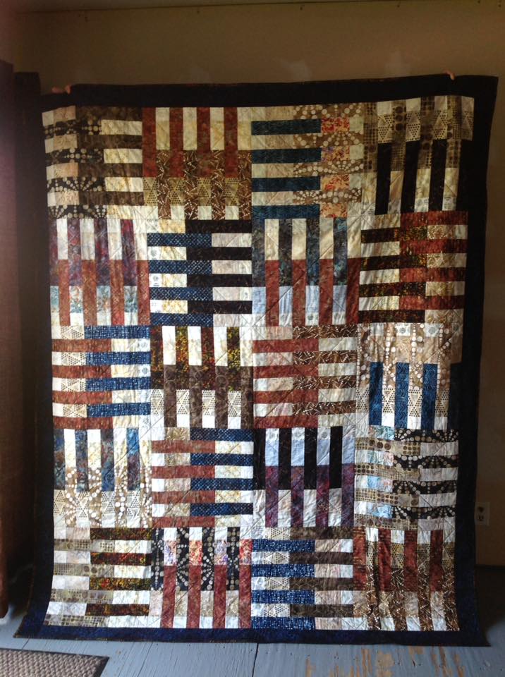
Now let’s make the medium blue a bit lighter in value than it is and see what happens when we look at the quilt. As I see it, the loss of contrast between the medium and light blue patch work pieces affects the motif that is created at the center of four blocks when they are joined. As you can see the element isn’t as defined as it was when the medium blue was a deeper value. We also lose the dynamic between the medium blue and the green accent fabric.


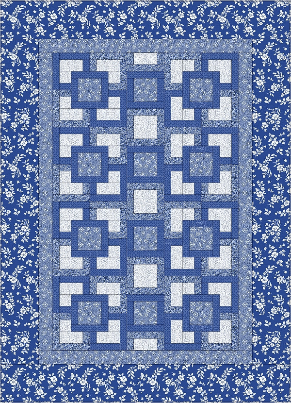
If we make the medium blue even lighter, we completely lose the element where the four blocks join and therefore the reason for having a medium value in the first place. The same is true in relation to the pairing of the medium blue with the green accent. You almost can’t tell the light blue from the medium.


Here is a comparison of the three examples as you would see them in the finished quilt. This should drive home the importance of good value contrast.

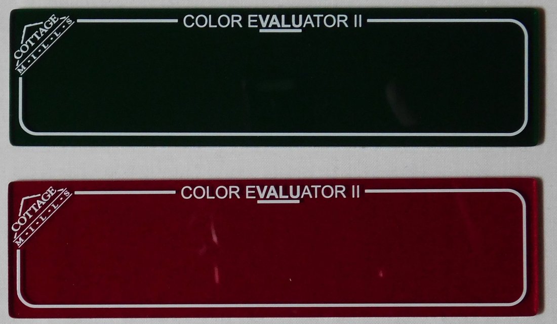
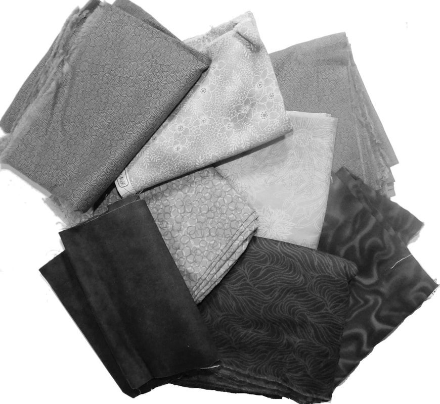
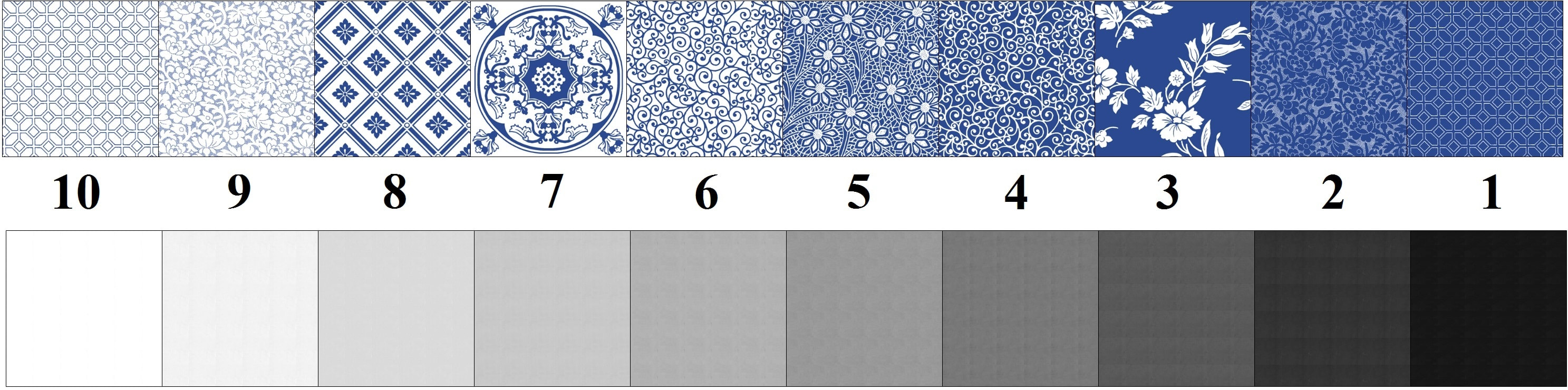
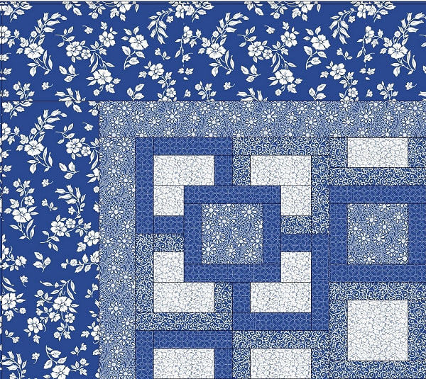
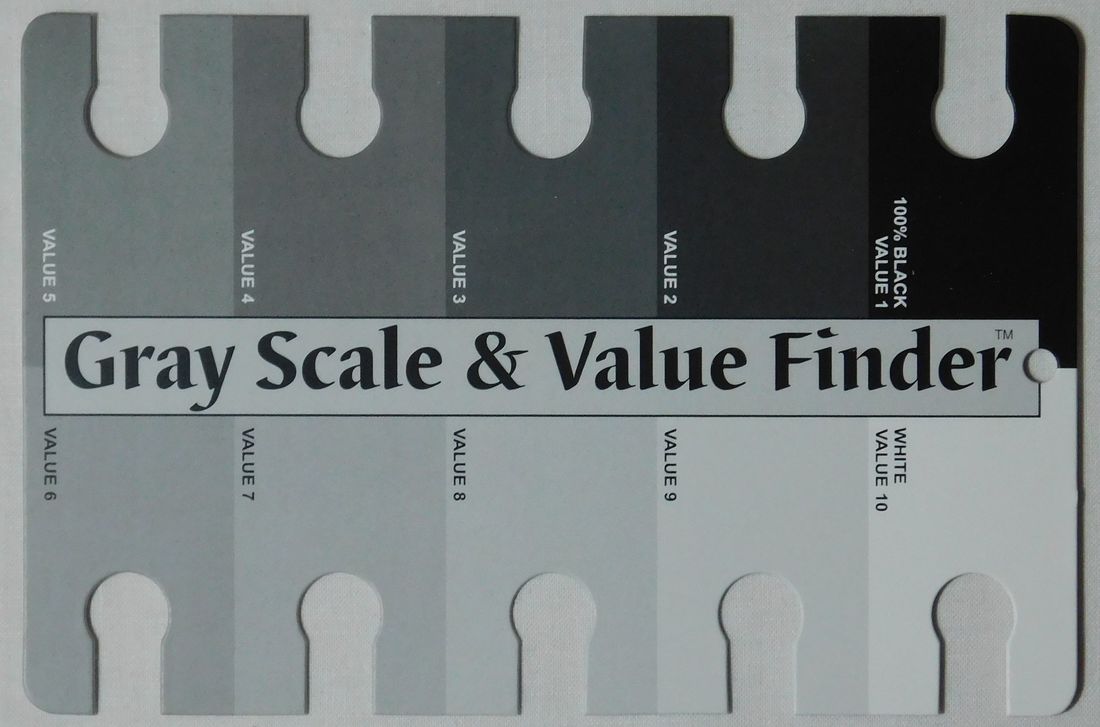
There are tools that will help you to discern the value of a fabric. You need a color filter and a gray scale value card. The color filters come in green and red. You use the red filter when working with cool colors and the green when you are working with warm colors. Since most of us work with a combination of the two, you will probably want to have both filters.
As you look at the fabric through the filter you place the value card near the fabric and move it around the values until you find the one that matches yours. The great thing about working with these tools is that eventually you will start to discern the value of the fabric without the red or green filter. I have these tools available at my ETSY shop for purchase. Click here to visit my shop.
As you look at the fabric through the filter you place the value card near the fabric and move it around the values until you find the one that matches yours. The great thing about working with these tools is that eventually you will start to discern the value of the fabric without the red or green filter. I have these tools available at my ETSY shop for purchase. Click here to visit my shop.

I hope you’re excited and feeling inspired by my post and the pattern I have offered you. I can’t wait to see what your version will look like! Please send me a photo of it when you have completed yours. And don’t forget to leave a comment. You can find the link for this pattern below.
Please share this pattern with your friends by giving them the link so that they can visit my website and download it themselves. I've worked hard to give you this gift, so I kindly ask that you do not copy this pattern in hard copy or as a digital file.
I hope you have a happy day full of quilting! Namaste my quilting friend, Janice
| whirlpools_tile_5_directions_rev_3.pdf |


 RSS Feed