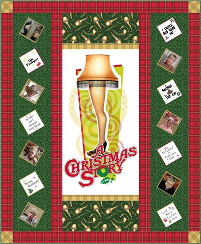
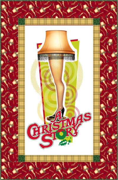
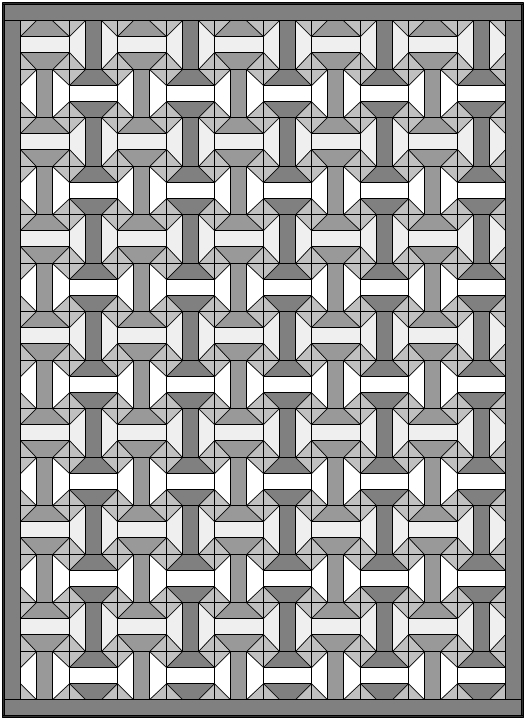
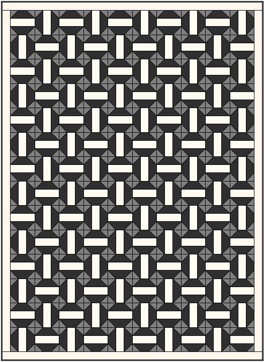
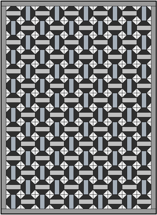
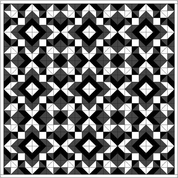
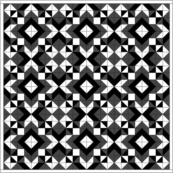
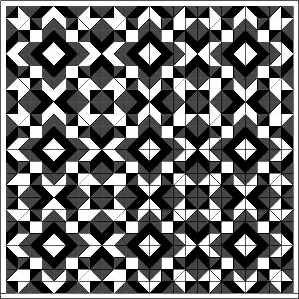
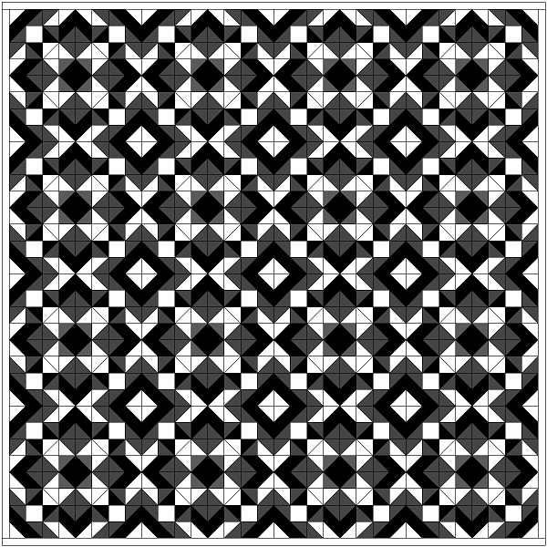
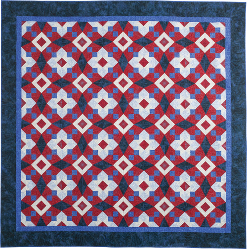
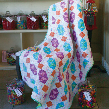
If you’re a fan of the classic Christmas movie “A Christmas Story” then you should be excited to know that Quilting Treasures Fabrics has a line of fabrics that celebrates this iconic film. I was lucky to be the person that designed the projects for the collection. I came up with a quilt and a wall hanging for the collection. Click on the images below for the links to the free pattern downloads. I love all the fabrics, but I think my favorite is the Leg Lamp print that comes in red or green. Happy quilting!
2 Comments
New Quilt Design, Honeycomb, In Fons & Porter's Quilting Quickly September/October 2015 Issue9/23/2015 I have a new quilt pattern in Fons & Porter's Quilting Quickly September/October 2015 issue. The design is called Honeycomb. The fabrics in the quilt are from Timeless Treasures Pashmina collection. The pattern can be made using precut 2 1/2" strips. Fons & Porter has a new twist for constructing the “snow ball” units. You can watch a demonstration of their technique, on You Tube. The design is being offered as a digital download from Fons & Porter or you can purchase a kit from Keepsake Quilting. Unfortunately the kits are on back order and won’t be available until October 13, 2015. The inspiration for this design was the simple “Snow Ball” Block that we are all familiar with. I was looking for a new way of using this block so I broke out my trusty graph pad and proceeded to play. The first thing that came to my mind was to try rotating the units and create a larger block of four “Snow Balls”. The sketch below is the result. Then I sat down and played with the idea in my Electric Quilt software. The first idea I had was to connect the units to create a visual flow across the quilt. The first two designs didn’t do it for me. They felt a little heavy handed so I thought I would try something a little more subtle. On my third try I felt that I was closer to a great design. But I didn’t love the way the grey tone values related to each other. So I switched around the grey values around and decided this was what I was looking for. Now it was time to tinker with color and create a woven effect.
Yeah, I’m a cover girl! I have a new design in the September/November issue of Quiltmaker magazine and it’s on the cover. To celebrate, I want to give away a free copy of the issue. Leave a comment at the end of the article and you can win your free copy of this issue of Quiltmaker magazine. And if you haven’t already done so, I’d appreciate it if you could give me a “LIKE” on my Iris Quilts Facebook page. The giveaway ends September 18, 2015. Shortly after that, I’ll announce a winner. The quilt is named RUDENEJA. It a Lithuanian word used to describe the way the weather feels as it turns to autumn. I’m not of Lithuanian descent but I love autumn. So can relate to the sensation. Looking at the finished quilt, I feel the folks at Quiltmaker gave it the perfect name. I had the working name of Tile #4 for this design. The reason for that is because last summer and fall I had a great run of inspiration and designed a whole bunch of tiled designs. The best way for me to keep track of them was using numbers. This and all of my other ideas come from time I spend with my graphed sketch pad. It keeps me out of trouble…. most of the time. I’ve been inspired by the designs found on decorative tiles. The designs typically have a diagonal line of symmetry. When placed in a grid pattern the tiles create a design that looks far more intricate than it actually is. It creates an illusion of many different block units used together to create the final design. Click here to see an earlier blog I posted about tile designs. As I have done with my other designs, I come up with a block idea and then I sketch it out in a grid pattern to see what it looks like. For this design I started with the block rotated in one direction and then tried it out with the opposite rotation. When I’m happy with the result, I go to my Electric Quilt software to play with it some more. First I try the design out in black and white. Then I start to add dark greys to subtly contrast with the black. Once I see an interesting pattern, I then add lighter grey values to the design to make the design visually pop. About half way through the process I returned the blocks to their original rotation. I realized I liked it best that way. Once I have a layout and a coloring that I like, I’ll try it in various fabric collections that I find in my Electric Quilt software. Here are a few. Please take time to leave a comment below for a chance to win a free copy of this issue. Also, remember to visit my Facebook page and give me a “LIKE”, if you please.
Happy Quilting, Janice In January, of this year, I had the pleasure of taking a workshop with Renae Merrill. Renae Is a self-professed “spiral-maniac” who has written two books about making spiral quilts; Simply Amazing Spiral Quilts and Magnificent Spiral Mandal Quilts. I bought Magnificent Spiral Mandal Quilts many years ago and never got around to trying it out. Then Renae came to our guild to give her Magic Mirror Mandala workshop. I prepared for class by putting together a palette with gradient values from light to dark. I started by finding an inspiration fabric. This could also be considered a theme fabric but there is no guarantee that it will be included in the final piece. It was simply a crutch for putting together a cohesive palette of colors. During the class we used the clockwise and counterclockwise spirals supplied to us to draft a wedge. This wedge represents one eighth of the whole pie. Next we placed the wedge in a plastic sleeve and used dry erased markers to flesh out a pattern from the units. After you colored in your pie slice, you place a mirror on it to see what the whole thing will look like. At home I would load an image of the wedge into my kaleidoscope program so that I could see what it would look like as a whole. At first I tried to match the markers to the fabrics I had. This strategy didn’t work for me as they were not exact matches to my fabric colors. The marker colors were too bright. Also I planned on using dark to light values with the color and I found this hard to convey with the dry erase markers. After my first three attempts with bright markers I decided to try toning the colors down and reducing the number of colors. This helped me to see how they related to each other better. Another issue was that I couldn’t find a yellow dry erase marker and I felt that the orange marker was too bright. It was competing with the other colors in my marker palette. The other colors should appear darker than the yellow/orange. That’s about as far as I got in class. Later in my sewing room I decided to leave the parts that were to be yellow blank. This helped me to conceptualize it better. I was very satisfied with the result. But I had other “quilting” fish to fry so I had to set the project aside. Recently I was able to make time further the progression of this project. Now that I had decided on a layout, I used colored pencils to make a colored draft that would include the gradient values for each color. It took three tries before I came up with a design that I liked. Then I realized that I had included a green/yellow in my green palette to represent the lightest value. This was a problem because I don’t have any yellow green fabric in my palette. So I made one more version that used a very pale green tor represent the lightest value. I also changed which purple I was going to use in the center. After I finally had what I thought was an awesome sketch it was time to make it in fabric. This took some time as I had to be careful not to mix up the little pieces. After a week and a half I had finished my wedge and I love it! Again, I loaded an image of the wedge into my kaleidoscope program so that I could see better see what it would look when finished. I think it looks awesome. I have to put it away for a while and work on some other things. But now that I have the one finished wedge for reference the other seven will go much quicker. It may be a while but I definitely plan on finishing this project.
The Book Cliffs are represented by the zig zag horizontal rows. The alternating rows contain a traditional block known as squash blossom. I've had my mind on this block for a long time. This seemed like the right time for including it in a design. This quilt was finished with long arm quilting by Janice Roy.
I’ve posted some pictures sent to me by Katherine Kohler of her version of the Squash Blossom quilt design. It looks beautiful! I especially love the glamour shot. Katherine put together her own group of tonal prints for the grey, brown and turquoise palette. I love her fabric choices. She also sent detail shots of the quilting. Nice work, Katherine! Hi Folks. I don’t know about the weather where you are, but we’re having a little bit of a heat wave here in Connecticut this week. So I thought this would be the perfect time to share a picture of my backyard covered in snow. You may be wondering why my yard looks like a snow cone. Well it’s because my friend Rachael and I did a little snow dyeing at the end of the winter and after we were done, she decided to "chum" my yard with the left over dye. I say she "chummed" it because if you had seen her with the cigarette hanging out of her mouth, tossing spoons full of left over snow dye over her shoulder into the yard, you would have thought that it looked like the scene in “Jaws” with Chief Brody scooping chum out of a bucket and he realizes they should of had a bigger boat. It was a beautiful late winter day. The winter was beginning to the thaw out into spring. So we decided it we better get some snow dyeing done before it all melted. I looked up directions for the technique online and found written directions & YouTube video from Pro Chemical & Dye. I was so excited about our adventure that I didn’t remember to take any photos until we were done. But that’s O.K. because if you Google search “Snow dyeing directions” you’ll find a bunch of bloggers who have tried this and were better about taking photos than I was. Basically there are two ways you can do it; you can either pile the snow on the fabric then add the dye to the snow. This technique can get tricky if you don’t like muddy colors or earth tones because of the way the dye flows through the snow isn’t very controllable. If you want to keep the colors a bit more separated then make individual snow cones in bowls of one color to each bowl. Then place piles of colored snow on the fabric. This is the technique we used and we were very pleased with the results. We used I/2 yard and fat quarter cuts of fabric. I laid out all my fabrics next to each other and then piled on the colored snow. This created coordinating fabric because the fabrics contained similar colors. I hope you enjoyed this little flashback to winter! And don't forget to try snow dyeing next year.
Happy quilting, Janice I have a new design in Quiltmaker Magazine’s July/August 2015 issue. The folks at Quiltmaker named the design a Hero’s Homecoming. I thought this was a great name for the quilt as shown in the magazine as it’s a Red, White & Blue quilt. Before that I was calling it Stormy Sea because of how the final design resembles a Storm at Sea quilt design. The funny thing is that I wasn’t even thinking of Storm at Sea while designing this. It was only after I decided upon the final value shading that I noticed. Once again, Janice Roy of Bridgeport, Connecticut did the beautiful quilting. Click on the underlined text for links to the magazine issue and quilt kit featuring this design. This design started the way most of mine do; it came to me as I doodled while waiting for an appointment. I can’t stress enough how important it is to carry a sketch book with you everywhere you go. You never know when inspiration will catch up to you. I started by filing in the squares on the graph paper to create an interesting pattern. For me, the pattern started out looking a bit like a stylized dogwood blossom. After sketching out a couple of repeats I looked for the base unit and marked with a couple of lines. Then I sketched it in the corner for reference. After I drafted the design into my Electric Quilt (EQ) program I colored it using only grey and black values for contrast. I next tried rotating the block in different ways to see what the design would look like. I decided I liked the original sketch best. After returning to the original version I toyed with adding different values and the placement of the values. Once I had the values and their placement decided I swapped the grey tones for a color. Next I added borders to the blocks that supported the scale of the design. Then I went looking through my EQ Stash files for a fun collection to audition in this design. The collection that caught my eye was one from McKenna Ryan called Acres to Go. In my EQ program I sorted the fabrics in the collection by value and replaced the grey values with the fabrics. I tweaked the fabrics and their placements until I had a look that was pleasing to me. I think this design would look great in any type of fabric. If you make one please send me the images and I’ll post it on my web site.
I have another new lap quilt design that I'd like to share with you. You can find it in McCall’s Quilting July/August 2015 issue. The design is named Nutmeg & Cinnamon. It’s made using “Spice Market” Tonga Treat precuts from Timeless Treasures. By the way, the beautiful quilting for this project was done by Janice Roy of Bridgeport, Connecticut. I own Electric Quilt (EQ) design software which gives me access to new fabric collections through their “Stash” downloads. I had purchased one of their stashes around the time that this idea came to me. I fell in love with the Timeless Treasures batik collections, so I did mock ups of this design using four other collections. Click on the images to enlarge. The design was inspired by a doormat I saw that was made of links. You may have seen these in your travels. I'm the guest blogger of the day on the McCall's Quilting Blog. They are posting an article about how I how I developed this idea into a quilt. It will also show you how I deal with color and value as part of the design process. Visit the blog and find out how to win a Spice Market Tonga Treat from Timeless Treasures just like the one used for the quilt. I have another quilt design to share with you. It's called Plinko and it's a crib or lap sized quilt. You can find it in the Summer 2015 issue of Fons & Porter's Easy Quilts. I named it Plinko because the diagonal elements in the design reminded me of the game plinko. You may be familiar with this game from seeing Plinko played on "The Price is Right" game show. My older sisters had a plinko game when I was little. I think all the disks were lost by the time I was old enough to play with it. Isn't that always the story? Anyway, the fabric collection is called French Navy by Studio 8 from Quilting Treasures fabrics. This collection includes pretty flowers and diagonal stripes in red, cream and blue. It was quilted by Pat Hluska. Click on the quilt for a link to the quilt kit. Click on the words that underlined for links to the fabric collection, the magazine or to see Plinko in action. This design came to me very quickly and didn't require a lot of further development. I sketched the design I envisioned first and then looked for the blocks within the design. Usually I design the block and then see what a quilt would look like repeating that block. Another lesson learned. As usual this was the result of time spent waiting for an appointment somewhere. I'd have to say is was time well spent. I recommend carrying a sketchbook with you where ever you go. You never know when you might run into inspiration and you should be prepared. As Edna Mode, from "The Incredibles", once said "Luck favors the prepared."
I have a new baby quilt design to share with you. It will be published by McCall's Quilting. You will find it in McCall's Quick Quilts June/July 2015 issue. The design is called Sweet Shoppe because the motif looks a bit like wrapped candy. This design uses Lulu Fabrics from Quilting Treasures © Sparky & Marie by Joy Creates, LLC. This is a pretty collection of bright and cheery prints. The quilting was done by Pat Hluska. For this design I didn't depend on my sketchbook. My goal was to take a common block and see what would happen if I changed the color placements in the block units. I have always liked the Shoo-Fly Block and decided to try using this block for my experiment. It's a simple nine-patch that holds a lot of potential. I used my Electric Quilt (EQ) quilt design software to help me explore the possibilities. I started with the original block in a tiled setting. Then I switched the color placement for two of the blocks half-square triangle units that were opposite each other. Instead of the colored triangle touching the center square it is now in the corner of the block. I liked the way this looked but felt that it needed something more to give it more interest. So I introduced an alternate block coloring. It seems that this was just what the design needed. Next I switched the grey scale values for colors. Here's a glamour shot of the quilt. Doesn't it look cute sitting next to the candy jars?
|
Janice Averill
|